While cleaning out our hard drives when moving to our new office, we came across an oldie but a goodie. This small brand project for boutique real estate brand Xchange Realty developed back in 2009. Partners Ruben Morales and Leonel Mendoza wanted a cool and abstract icon and name. And we delivered.
We created their mark to have a completely different look from other real estate companies. The mark, which is an ambigram, incorporates the letter X when seen as a whole. Within the mark, there’s also an abstract letter R when placing the middle blue diagonal bar alongside the abstract diagonal red bar to the right of it. This created a thought-out custom look for their brand that is sure to be different than the rest.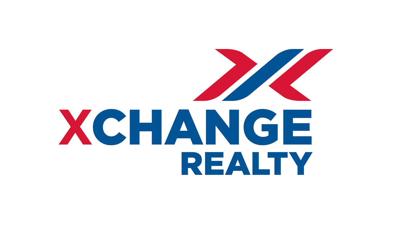
Of course every brand project starts with the logo and logo sketches.
![]()
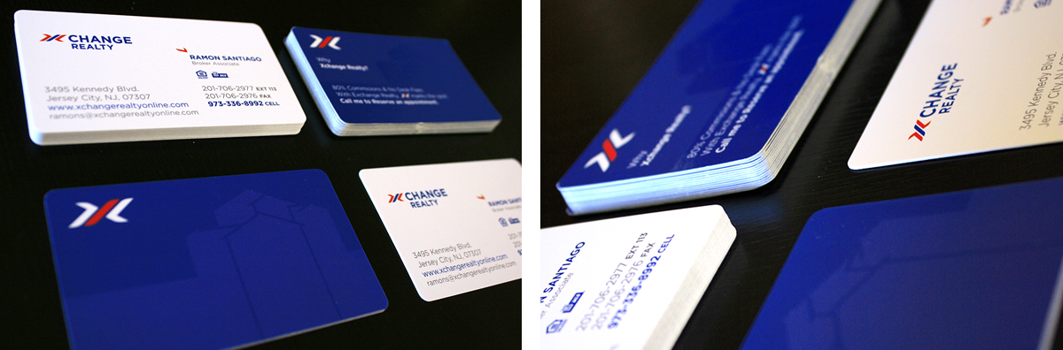
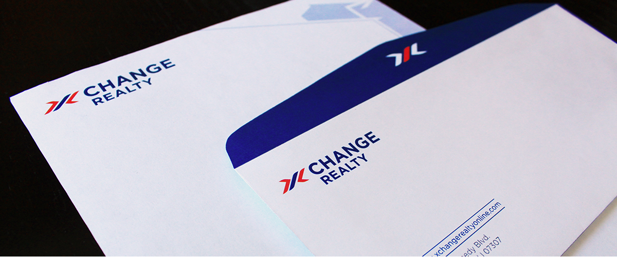
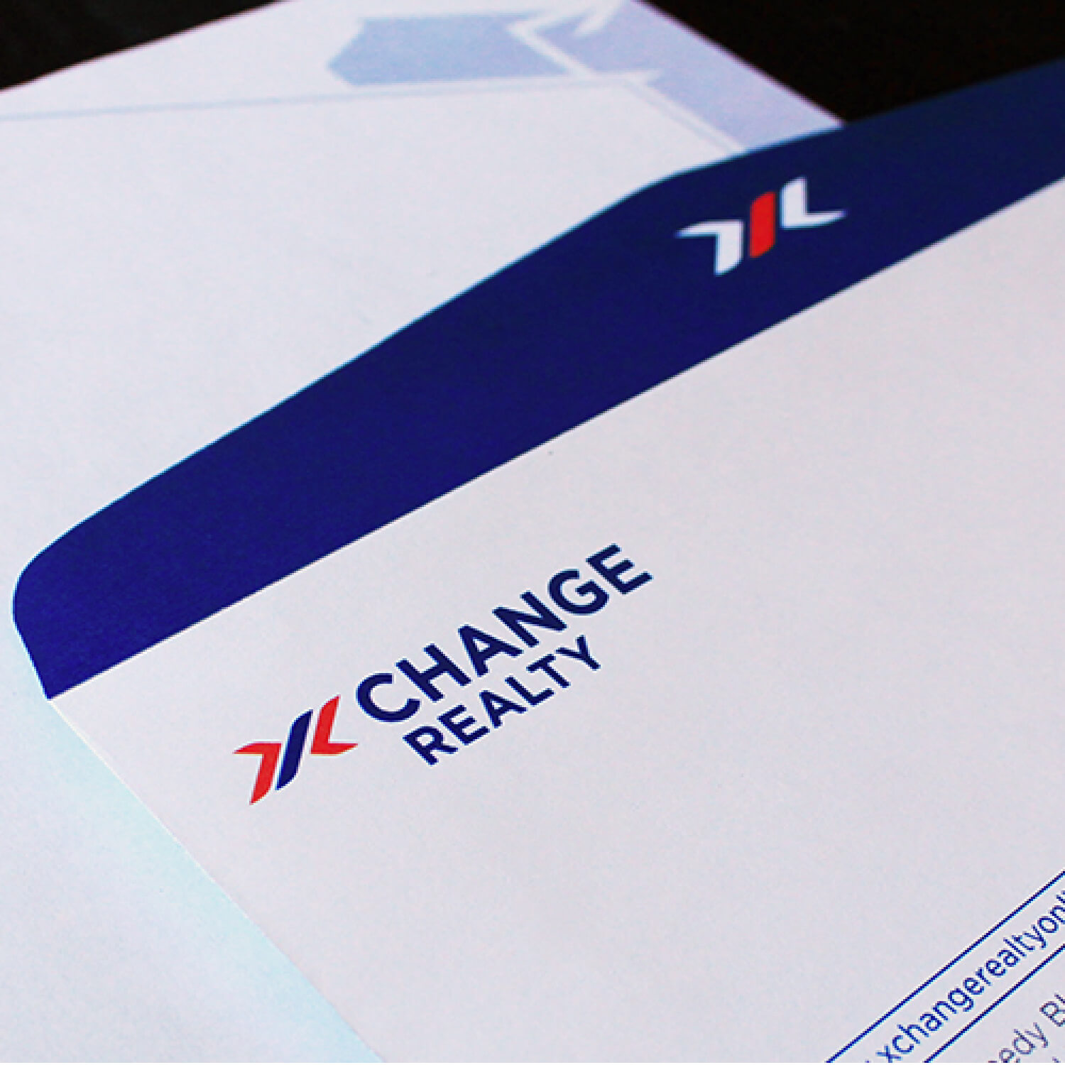
Once approved we were able to move on and create these really cool business cards and stationery. Everything was printed in full color and the business cards had a spot gloss pattern of houses on the back side of the cards.
Xchange Realty – Boutique Real Estate Brand Design
May 30
0 comments