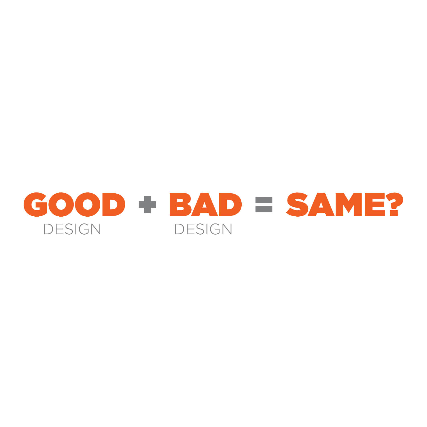
I’ve always wondered what makes good graphic design a “good design.” Were we born with a sense that evaluates a good or bad design? Were we raised through society to believe what good or bad design is? We may never know the answer.
But I believe a couple of points may help us understand. First, humans like order, and with order comes a refined and understandable aesthetic. Another would be legibility, and the last would be color and its impact.
Good graphic design transcends mere aesthetics; it’s a potent communication tool, especially regarding materials like restaurant menus and brochures. Whether you’re looking for a restaurant menu design or a catalog and brochure design, certain principles ensure that your designs catch the eye and effectively convey the intended message to customers and potential buyers.
Clarity and Readability
A well-designed menu or digital catalog should be easy to read. Use clear, legible fonts and organize information in a logical flow. For a restaurant menu, categorize items clearly (e.g., appetizers, entrees, desserts) to guide the diner’s journey. For brochures, headings and bullet points can help highlight key information and make the content easy to scan.
Visual Hierarchy
Important elements should stand out. In a restaurant menu, items you want to promote, like specials or high-profit dishes, should be positioned prominently and perhaps styled differently to draw attention. In brochures, the most crucial information or selling points should catch the eye first, using size, color, or placement to establish importance.
Consistency in the Design Process
Maintain a consistent style throughout the menu or brochure. This includes using a coherent color scheme, font styles, and imagery that aligns with the brand’s identity. Consistency helps reinforce brand recognition and ensures the design feels professional and trustworthy. Just using free menu templates doesn’t cut it in this process. Stick to the brand guidelines.
Appropriate Imagery
Use your own photos or graphics that enhance the message. For restaurant menus, high-quality images of your dishes can entice the appetite. For catalogs and brochures, relevant images or infographics can illustrate points and aid understanding, making the material more engaging.
Showcase a Call to Action
An effective design not only presents information but also prompts the reader to take action. For menus, this might be subtle, such as highlighting signature dishes or right in your face like a Buy One Get One offer. For brochures, more direct CTAs like “Contact Us,” “Visit Our Store,” or “Scan this QR Code” should be prominent and persuasive.
A skilled restaurant menu designer or catalog and brochure designer knows that the ultimate goal of their work is to make the material not only aesthetically pleasing but also functionally effective.
With over 18 years of experience creating custom menus and digital catalogs, we create compelling materials that serve our client’s needs and resonate with their customers and buyers alike.

