Project brief
In a very crowded Real Estate market, the need to stand out and apart from everyone else is a top priority. Sky Realty’s brand needed to stand for top-quality.
branding
The Sky's the Limit
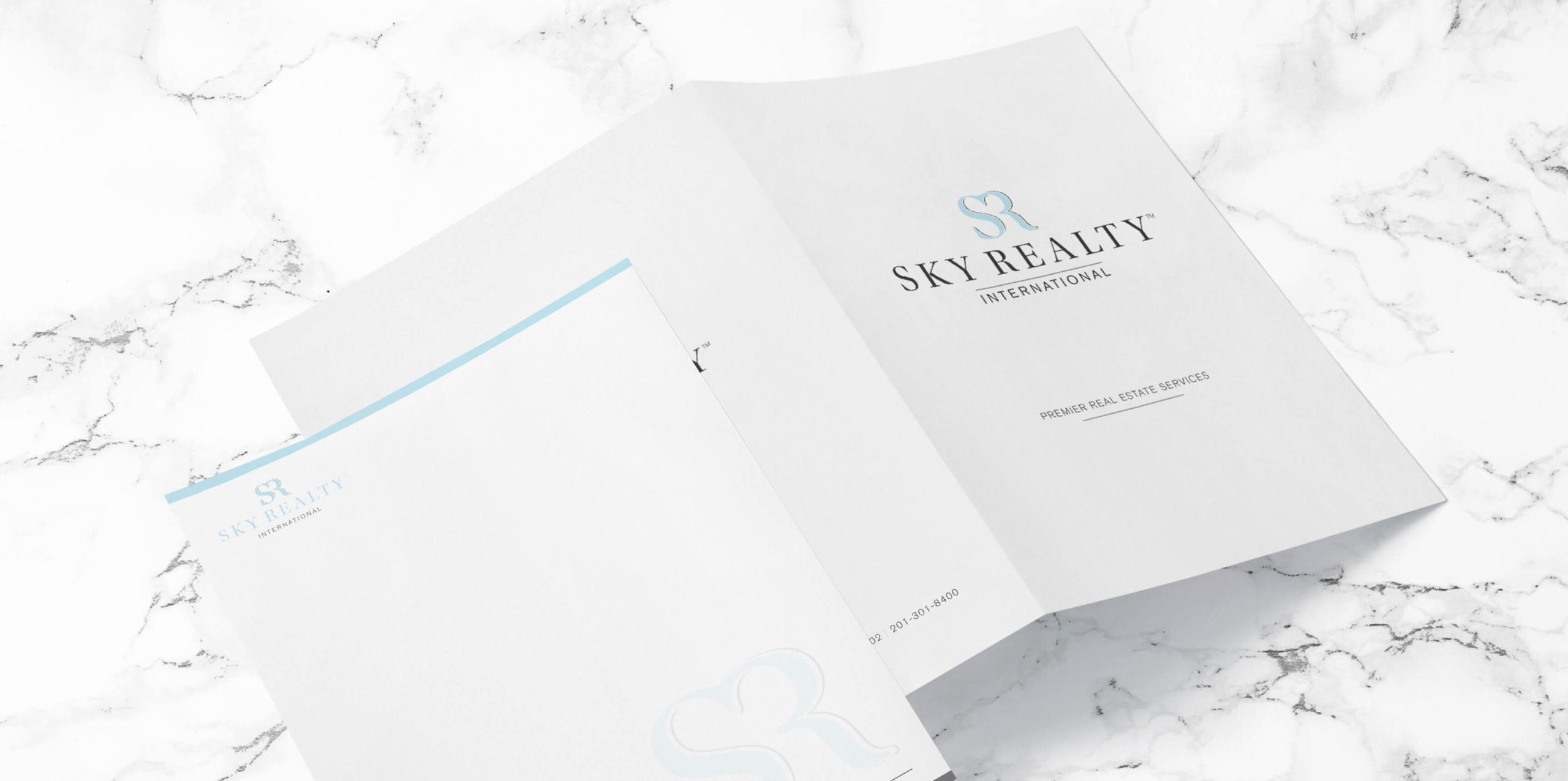
We focused on the letters SR for the Sky Realty International brand to create a clean icon that could be used as the focal point in all branding materials. As a result, SR is the primary icon used throughout the stationery, marketing materials, and online presence.
Color Scheme
sky blue
dark gray
white
Typography
Akzidenz-Grotesk BQ Regular

Akzidenz-Grotesk BQ Bold

COLLATERAL DESIGN
Inviting. Clean. Professional.
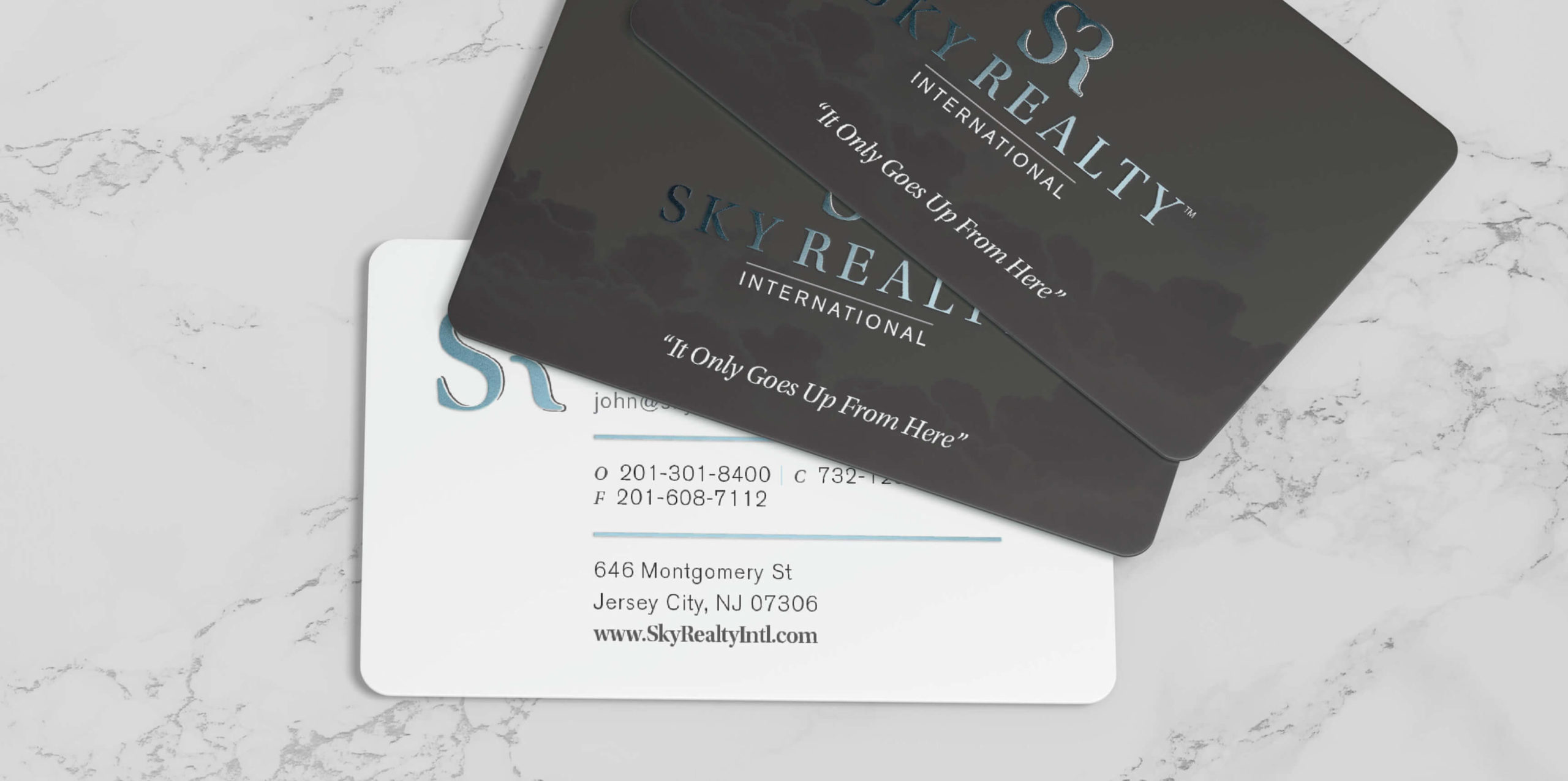
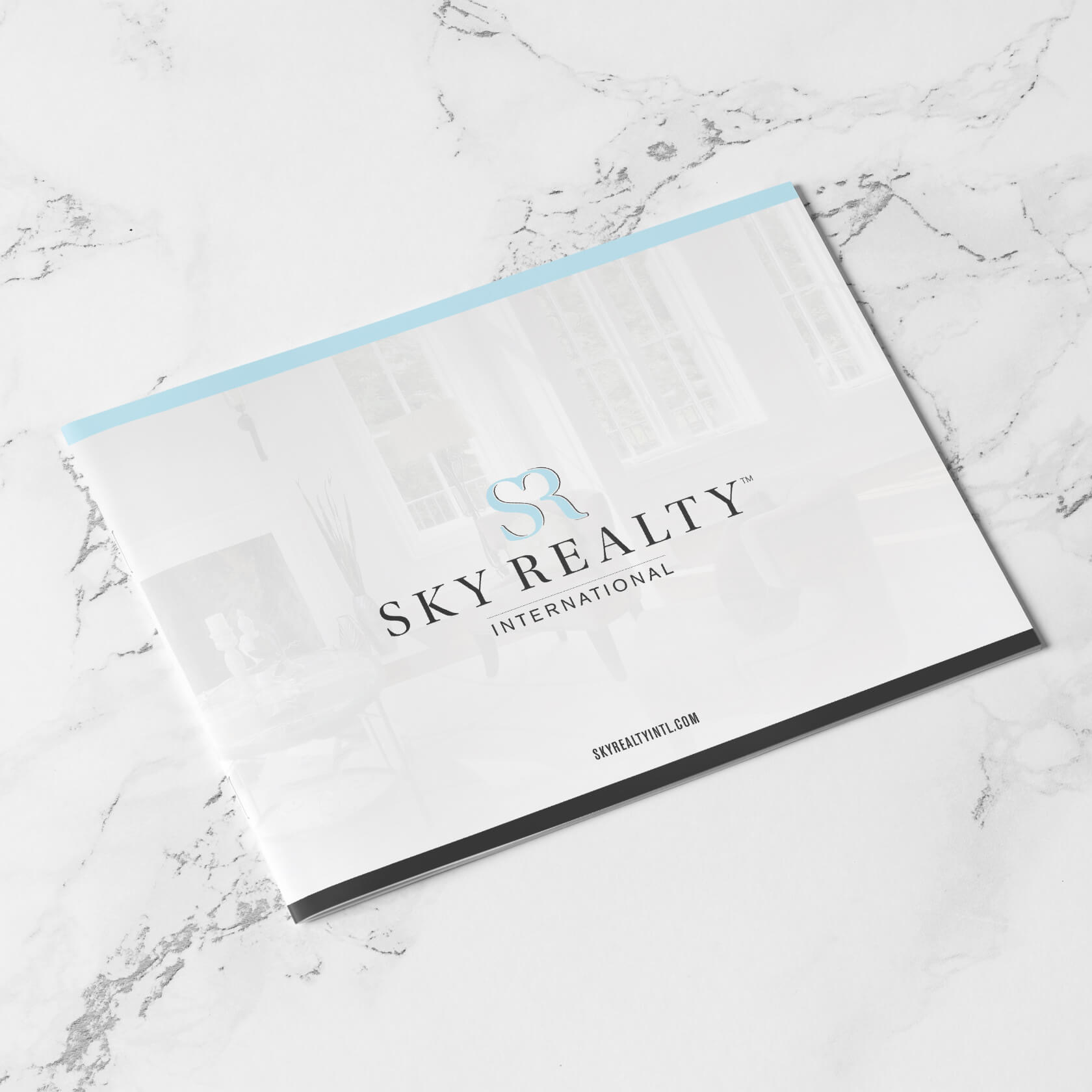
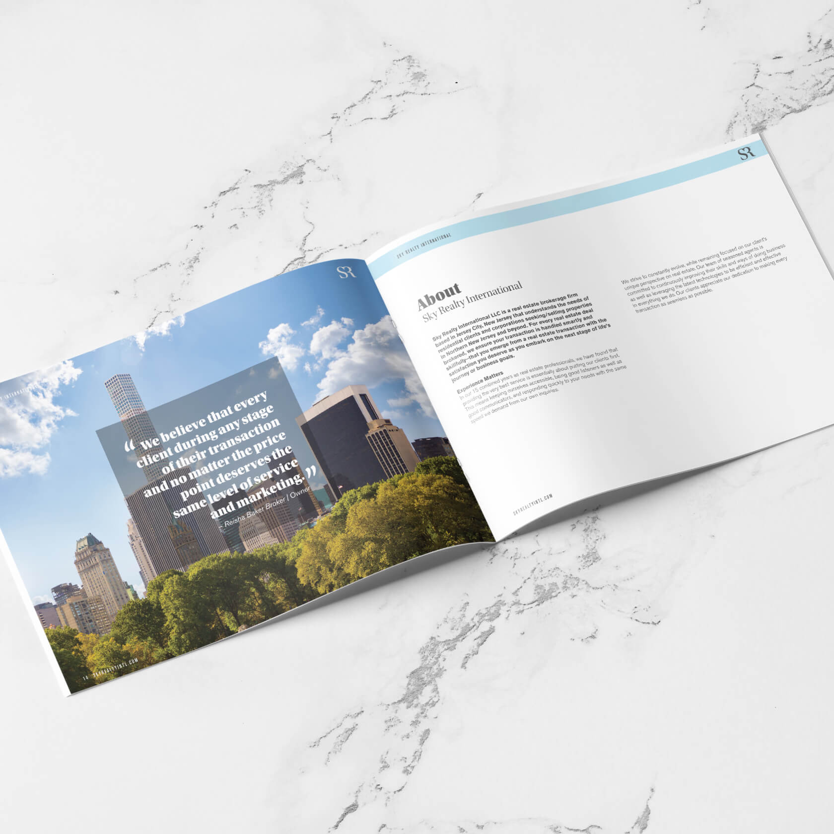
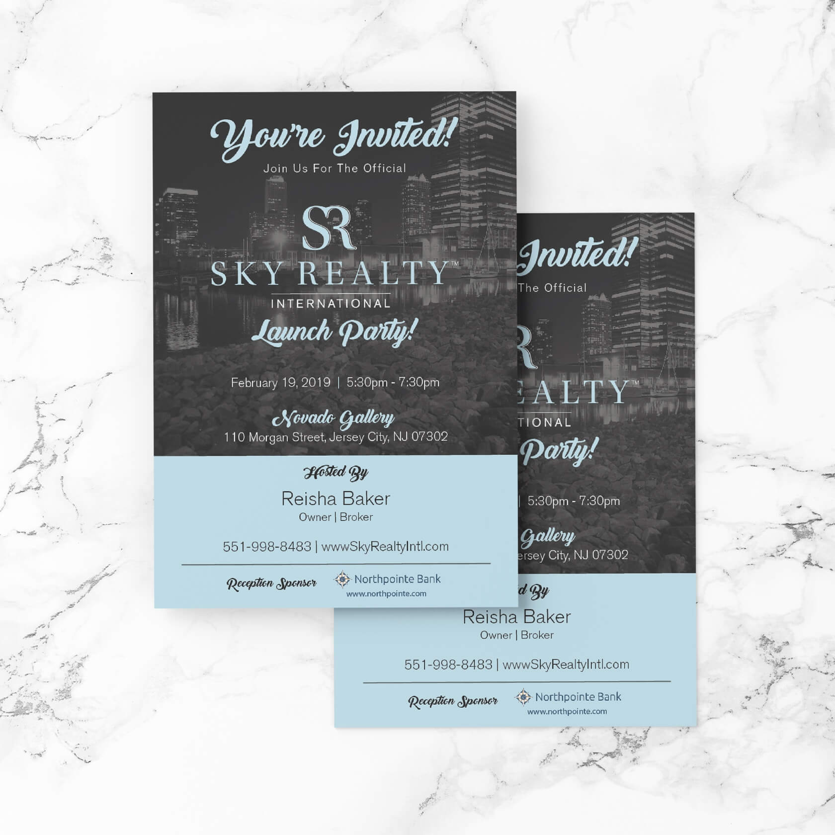
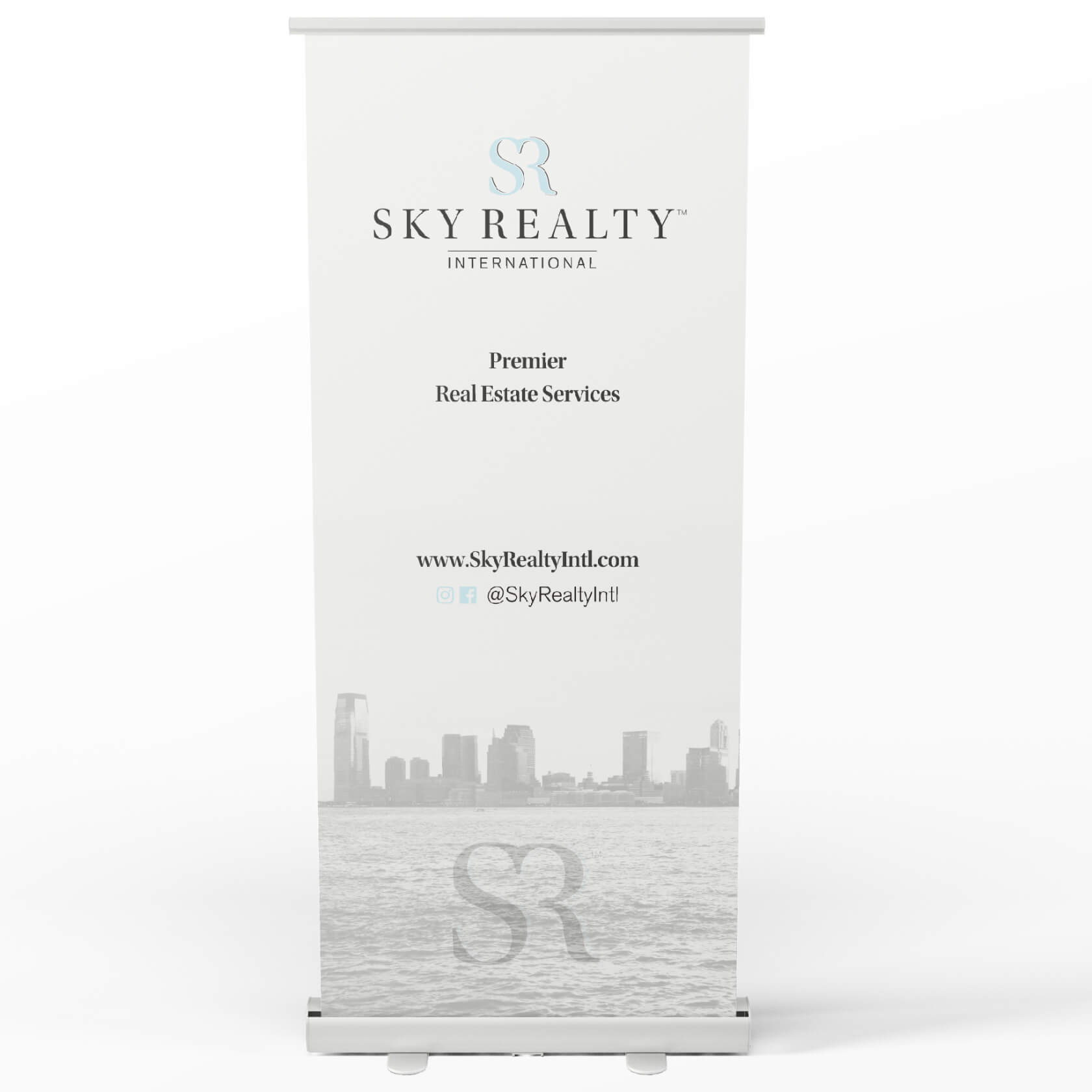
The brand development for Sky Realty International includes the usage of bold and medium-weight fonts to direct users' attention to important information. All images used feature high-end properties, families, and buildings with beautiful sky backgrounds.
Marketing Management
Pix-l Graphx clients are privy to their very own online ordering portal for agents and team members. Sky Realty was no exception, and our marketers built a custom ordering portal to keep business cards, stationery, and postcards ready to order.
