Project brief
We were tasked with creating a brand with printed and digital assets that would be sure to keep students and parents engaged with the program.
Branding
The Read Up challenge was quite the challenge. It is technically a program provided by the Carmel Hill Foundation of NYC, so the color scheme and look had to align with the parent brand. We also had to design a brand that was appealing to young kids of just 6 years old to teenagers entering high school.
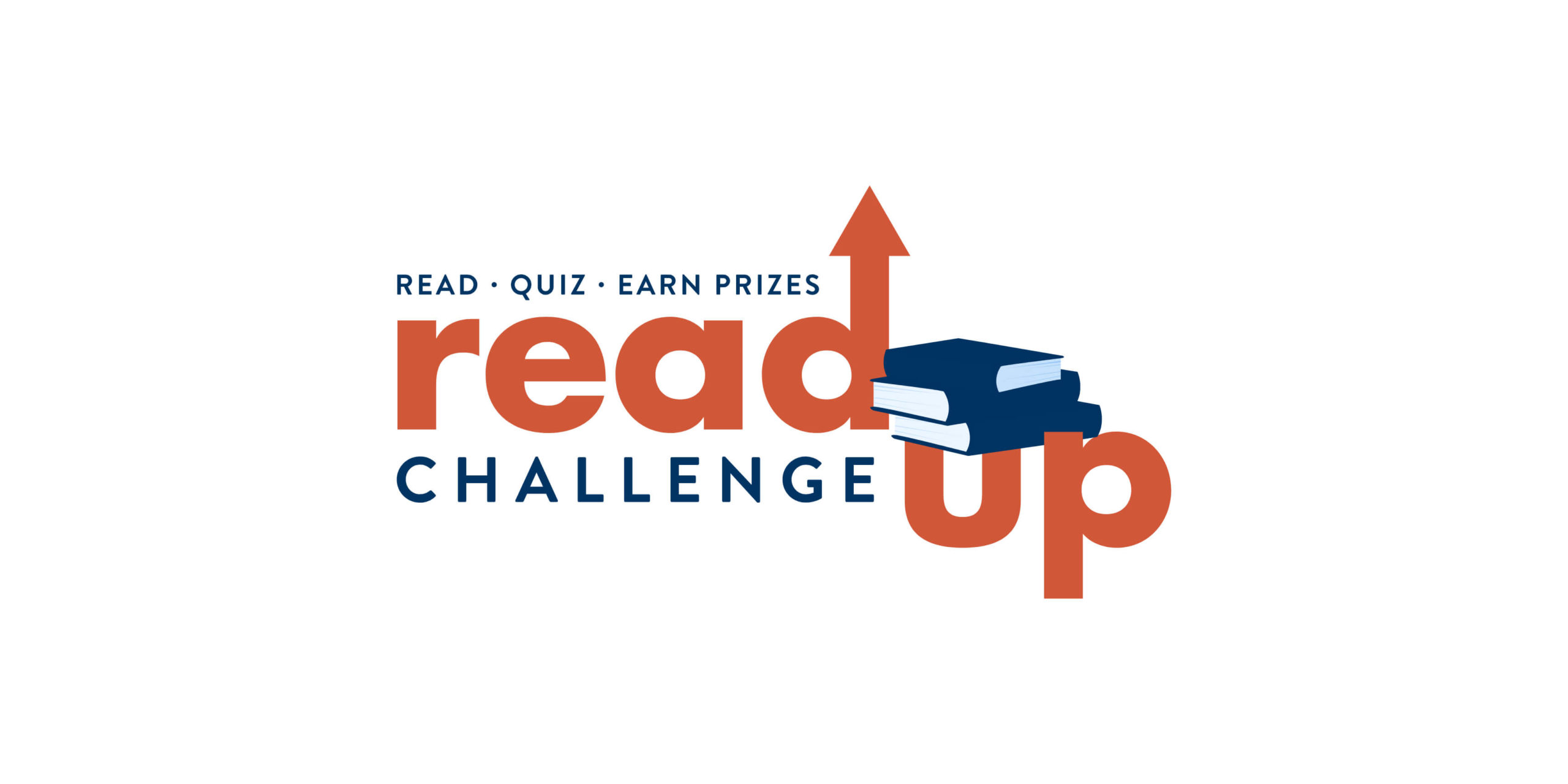
Color Scheme
dark blue
orange
light blue
yellow
Typography
Silka Medium

Silka Bold

Marketing and Swag
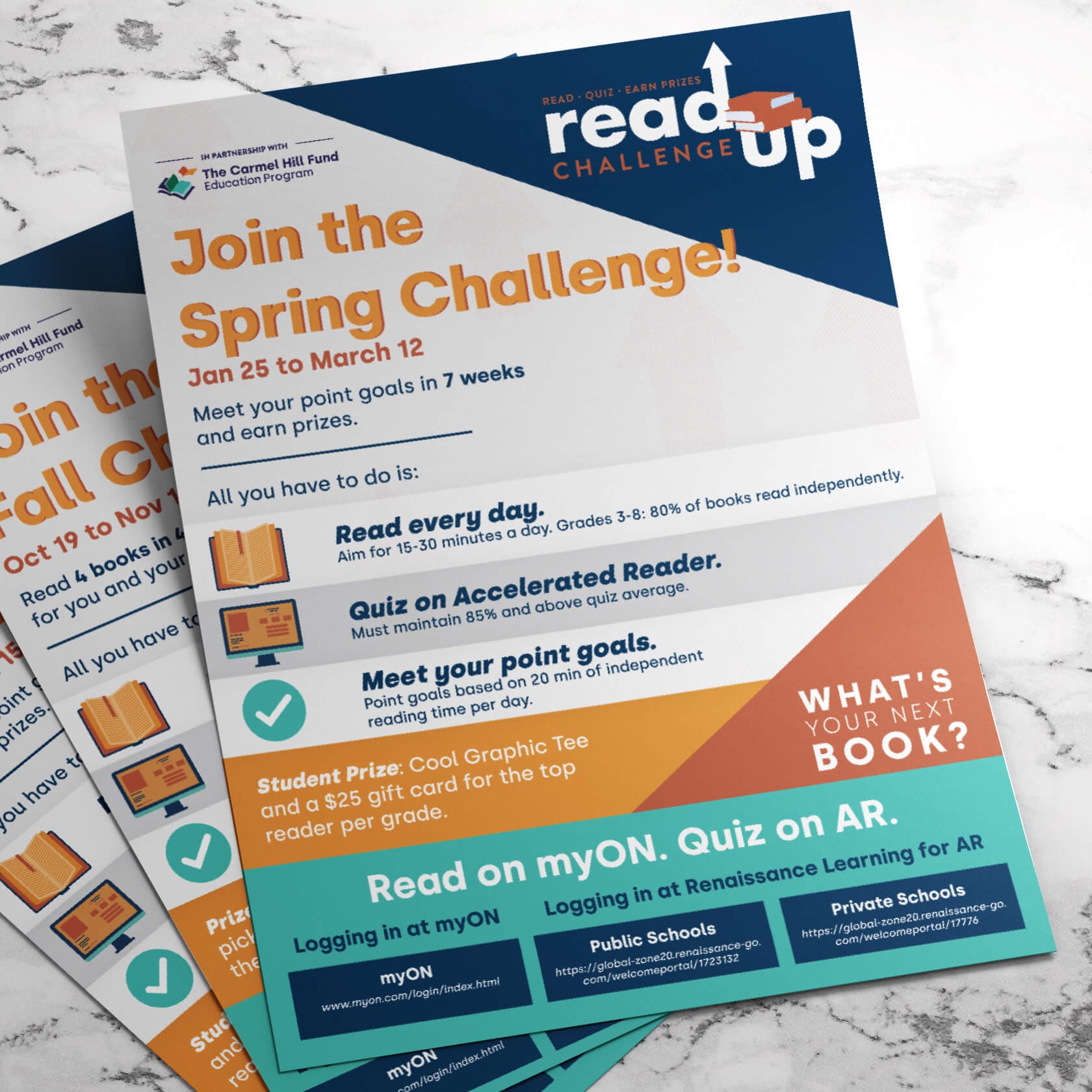
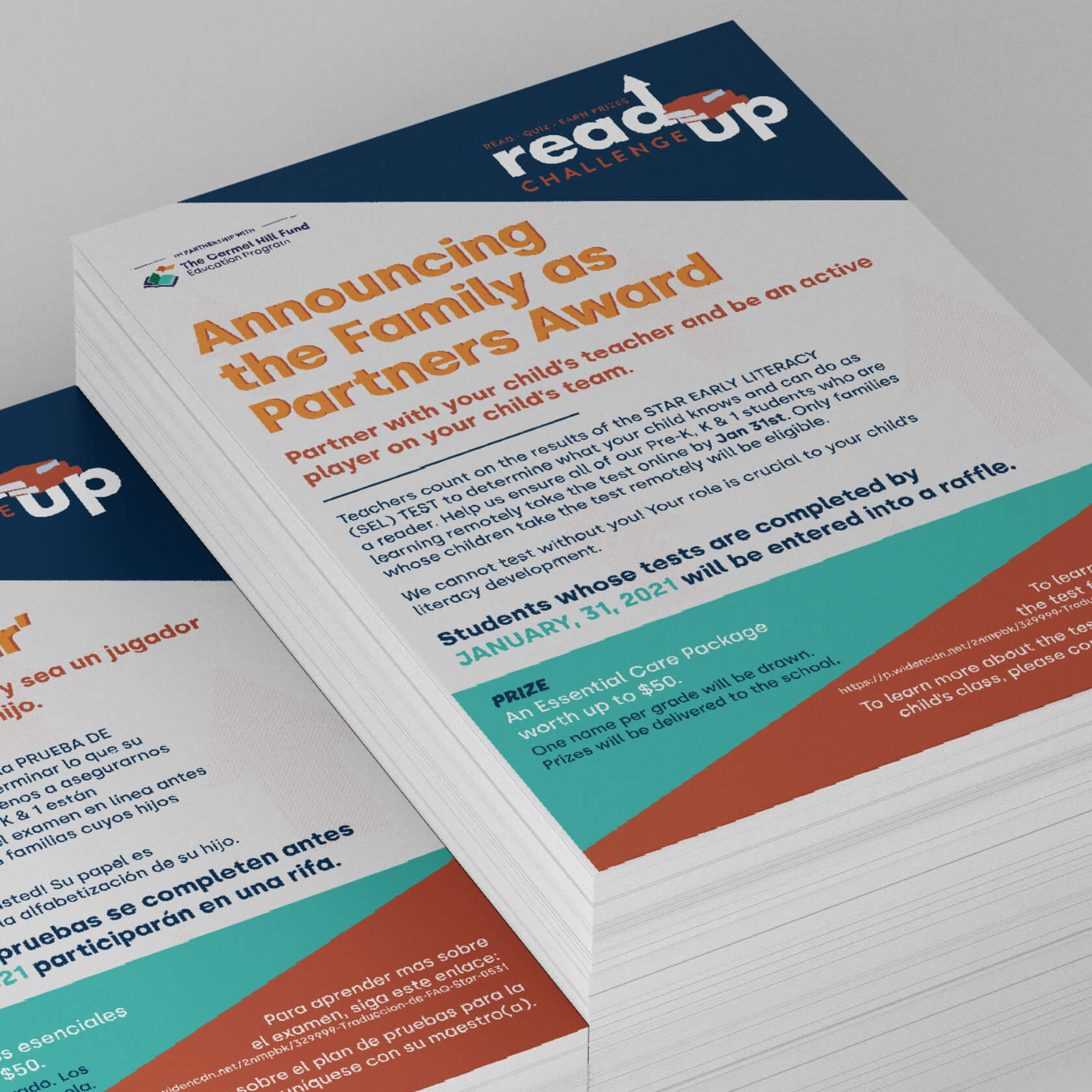
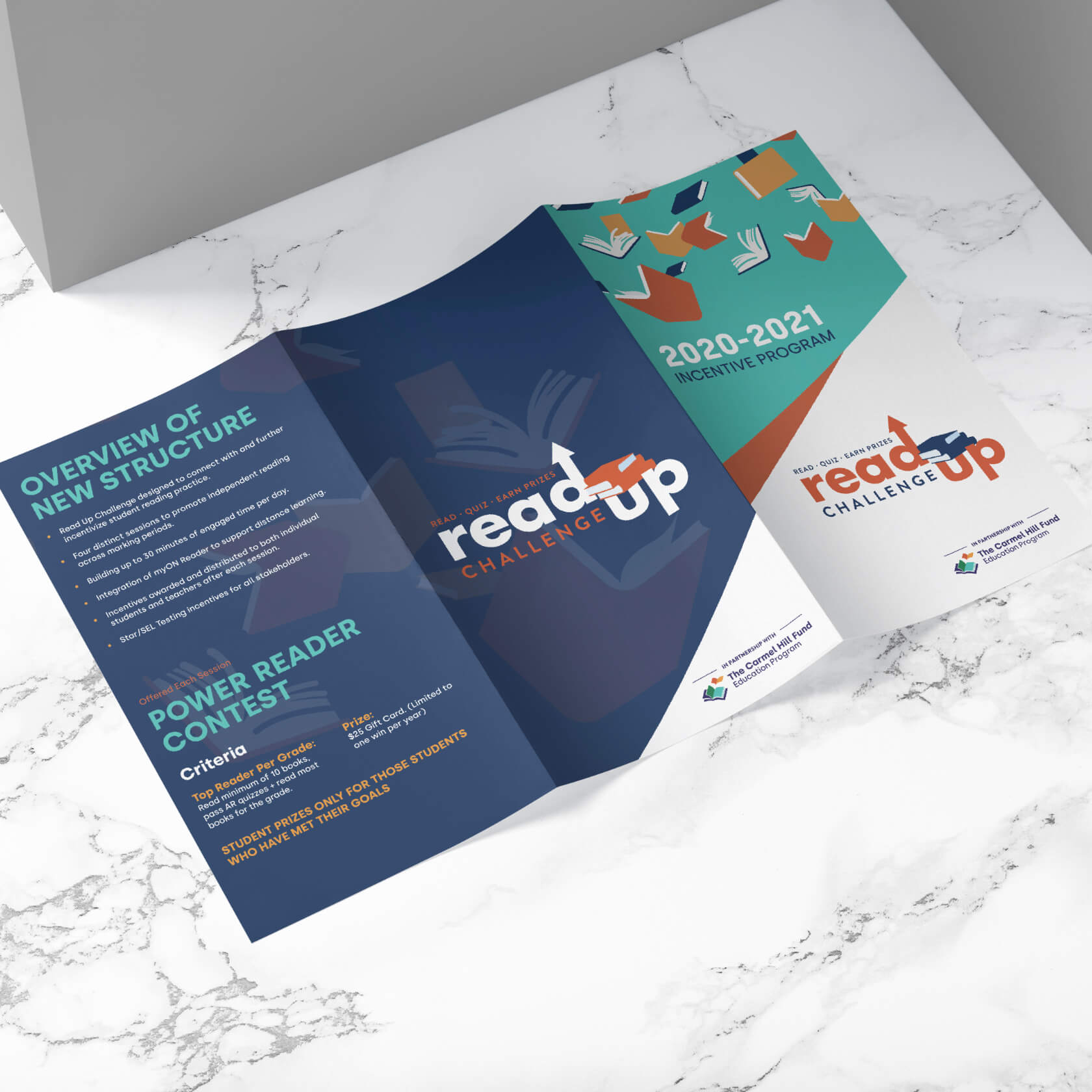
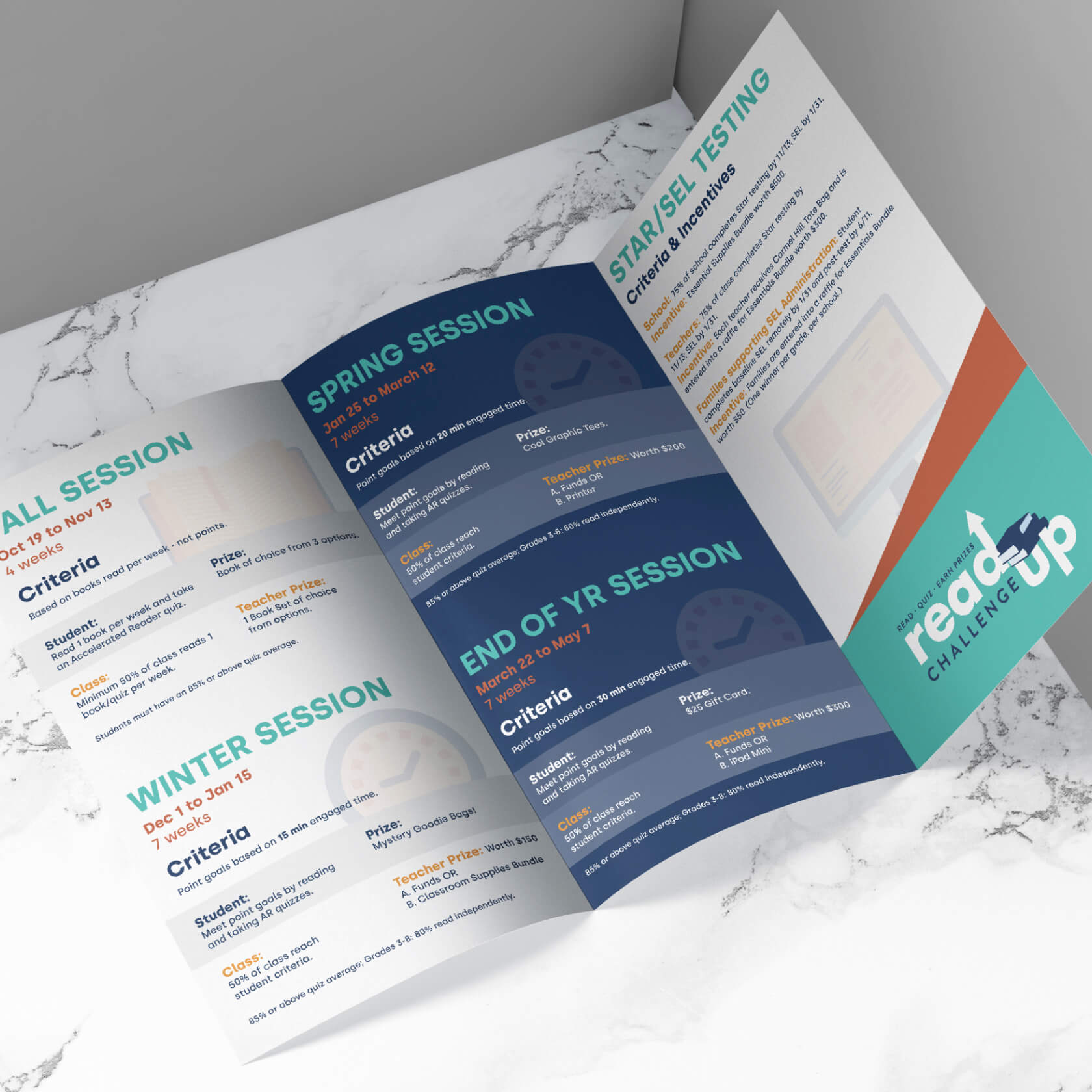
The Read Up Challenge project required marketing materials for two distinct parts of the campaign. Part one included digital presentations and printed materials that would provide awareness of the campaign for the teachers, students, and parents.
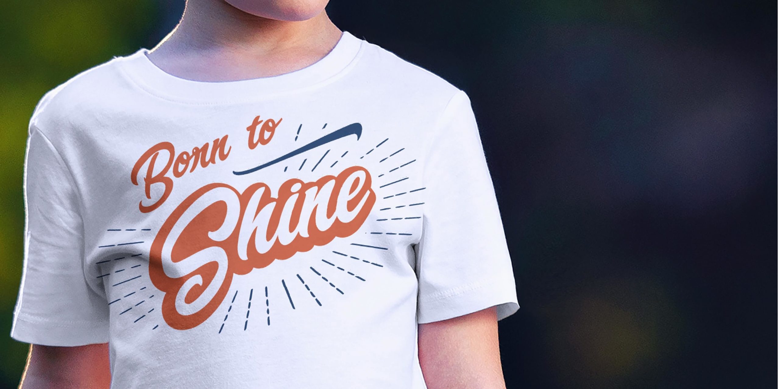
The second phase included printed materials and custom-designed t-shirts for the students.
Video and Motion Graphics
Easily Find Your Home.
Launching a campaign of this caliber requires a lot of awareness and the delivery of the essential details in an engaging manner. To achieve this goal, we were tasked with developing a custom video with all of the campaign details. The custom video was a mix of motion graphics and clips overlaid with a custom voiceover.
