mamasushi.
What started off as a Small Corner Spot on Dyckman Avenue in NYC, has now transformed into a growing brand with more than 6 locations in 3 states. To support that growth our team updated the digital presence and make sure every touchpoint is seamless.
Project brief
The fusion of Dominican and Asian cuisine became a big hit in uptown NYC with the Launching of MamaSushi.
Branding
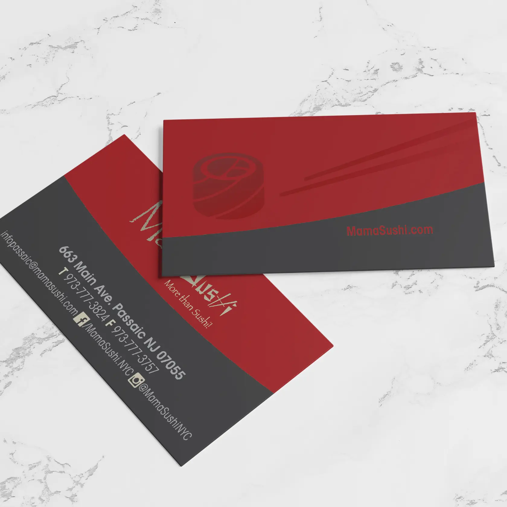
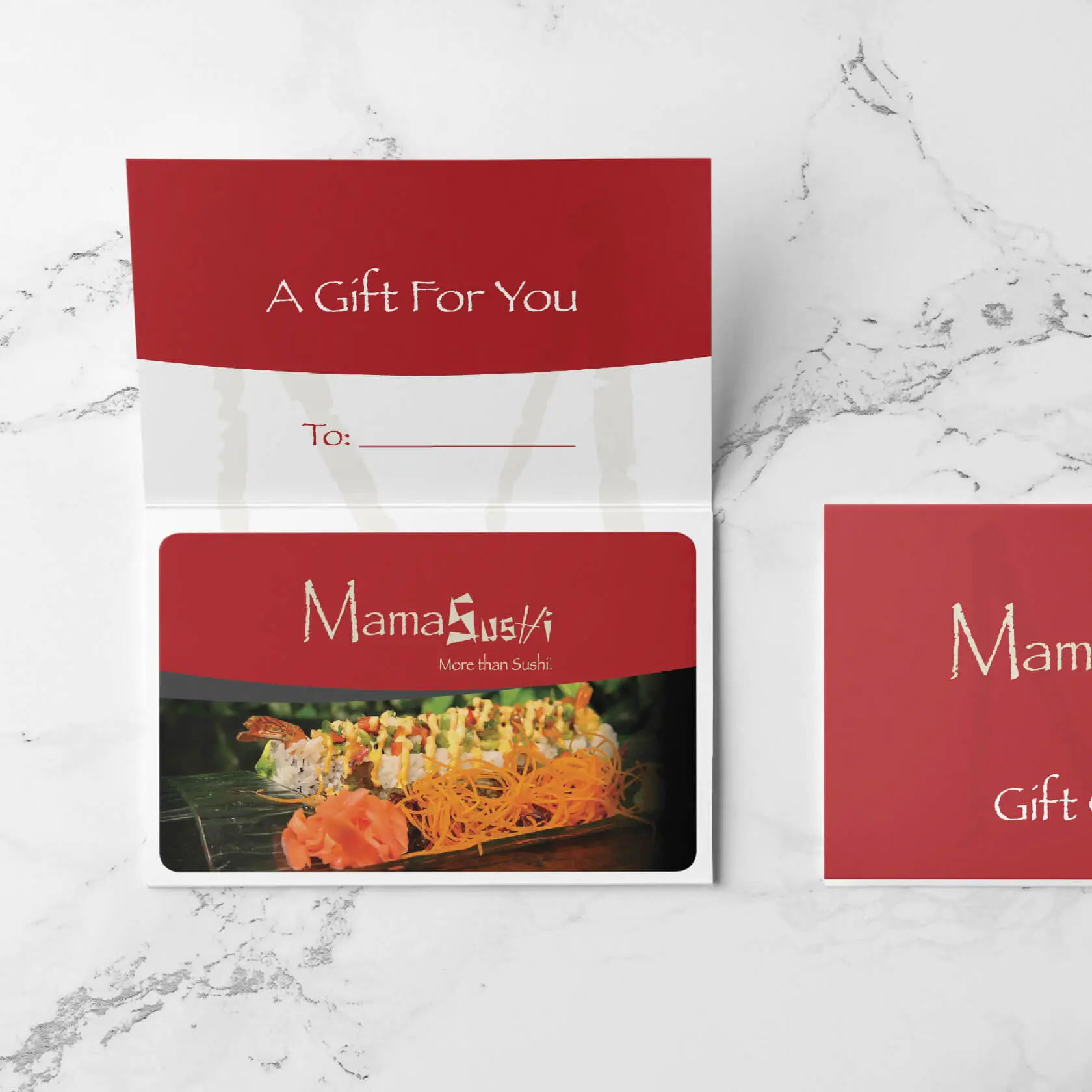
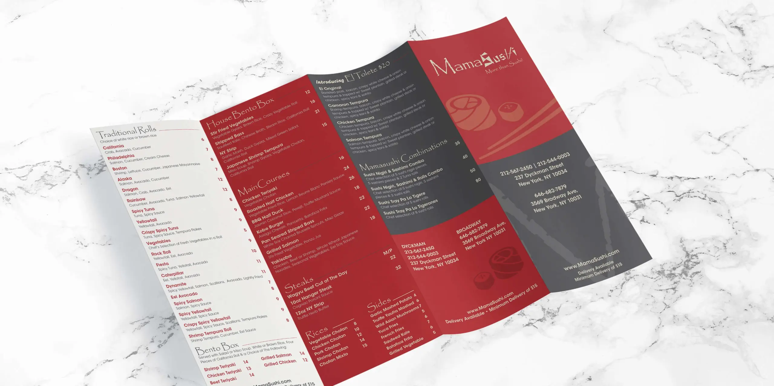
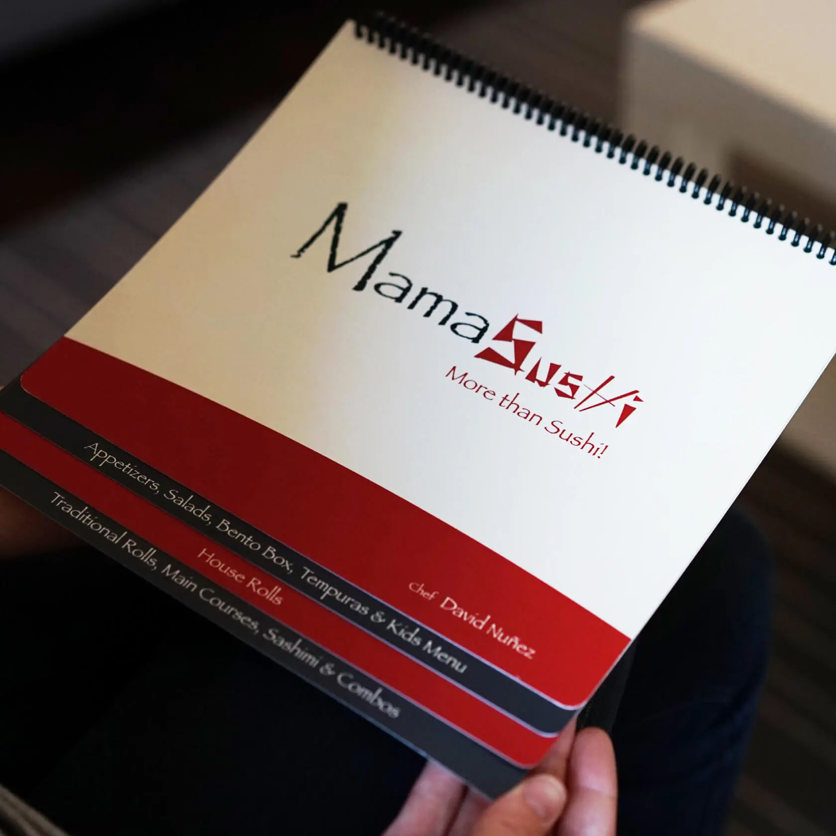
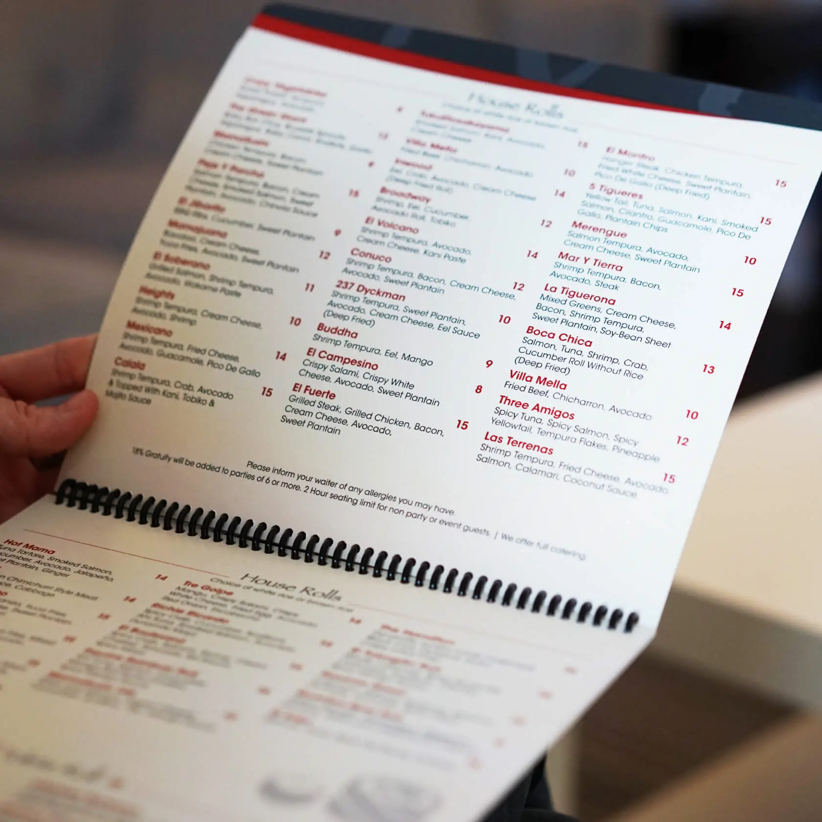
Style and Durability
Though it's a sit-down restaurant the vibe in MamaSushi is always high energy and exciting. There’s food, drinks, hookah, and sometimes live entertainment. This is the main reason for creating branded elements that are durable and easy to clean while maintaining a high-quality branded look.
Color Scheme
red
#B12024
gray
#414042
beige
#E3DEC9
black
#100E0C
Typography
ITC Avant Garde Gothic Std

Papyrus

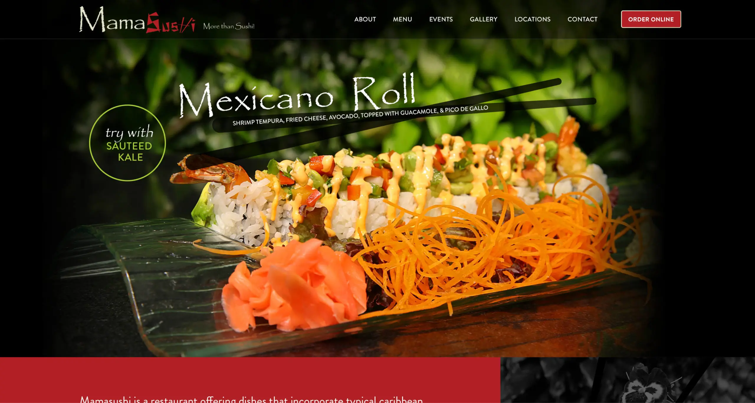
website
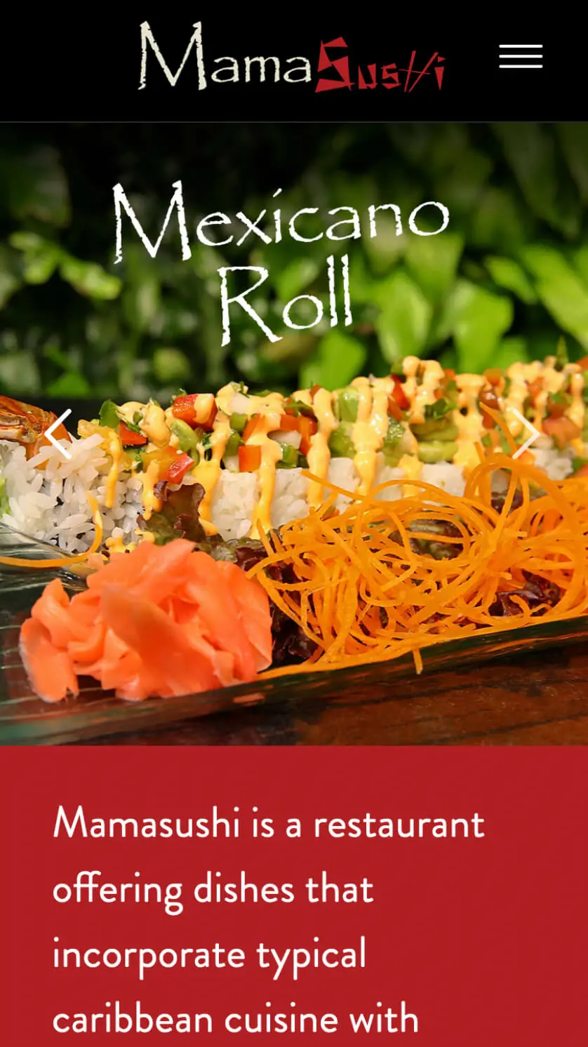
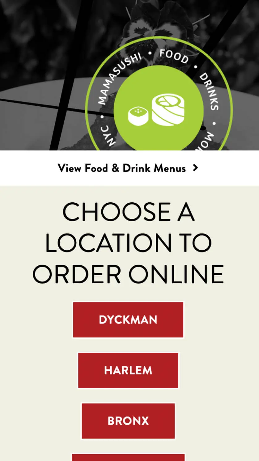
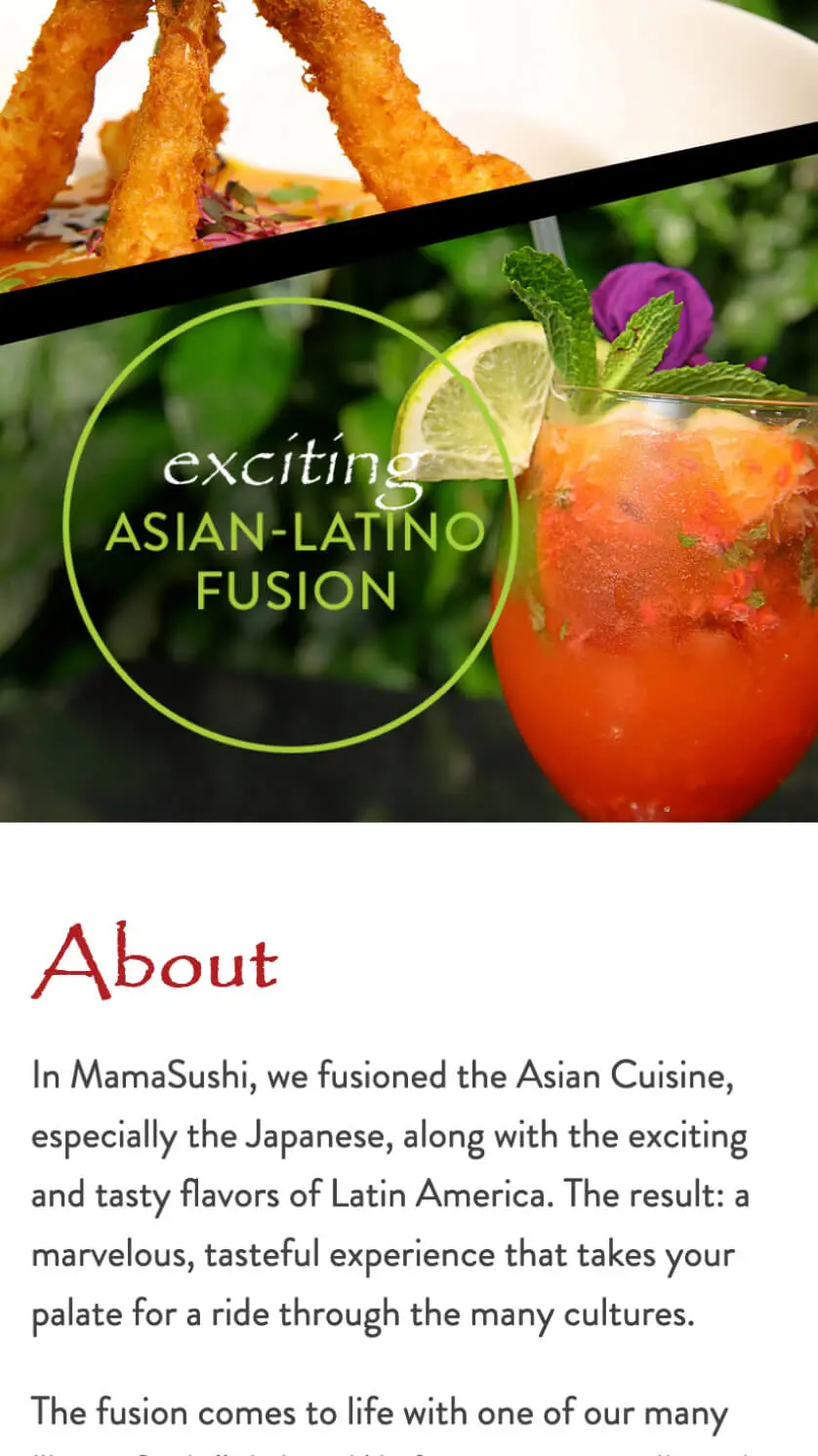
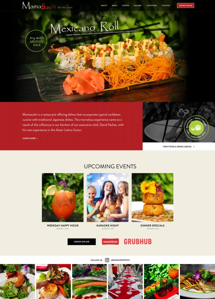
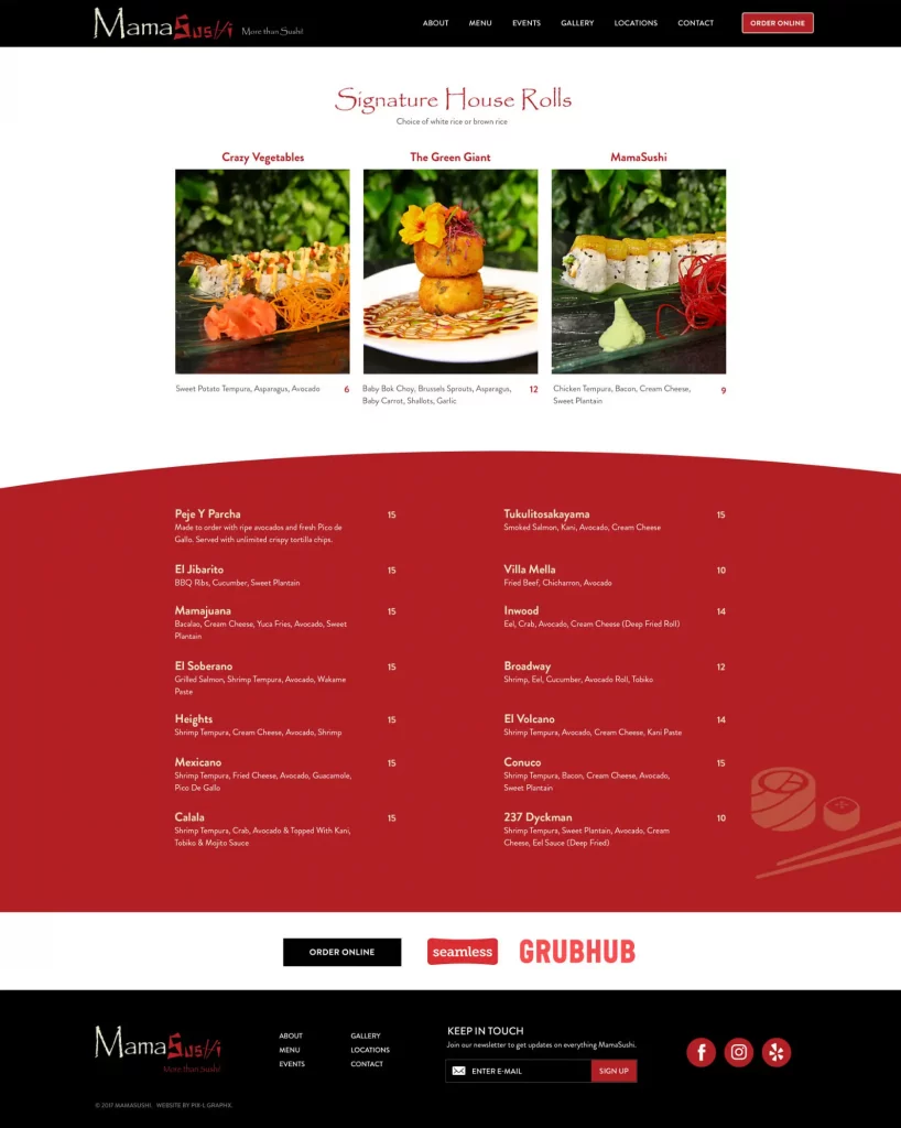
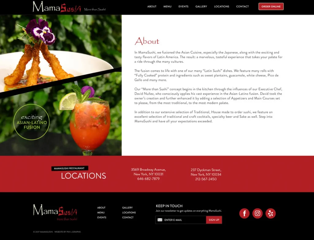
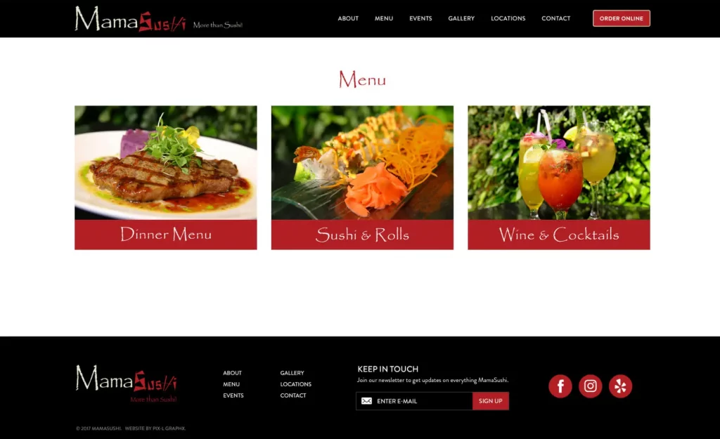
Mamasushi growing at a rapid rate so they needed a website that was great looking and easy to manage. We developed the website for Mamasushi using our custom Restaurant Website Platform in WordPress. This allowed them to quickly launch their website but ensure design and functionality were not compromised.
mobile
