Project brief
The team at Main Street Title needed to update a brand that was in their words, “antiquated”. This required a full overhaul of the entire brand.
Branding
Classic Style with a Modern Twist
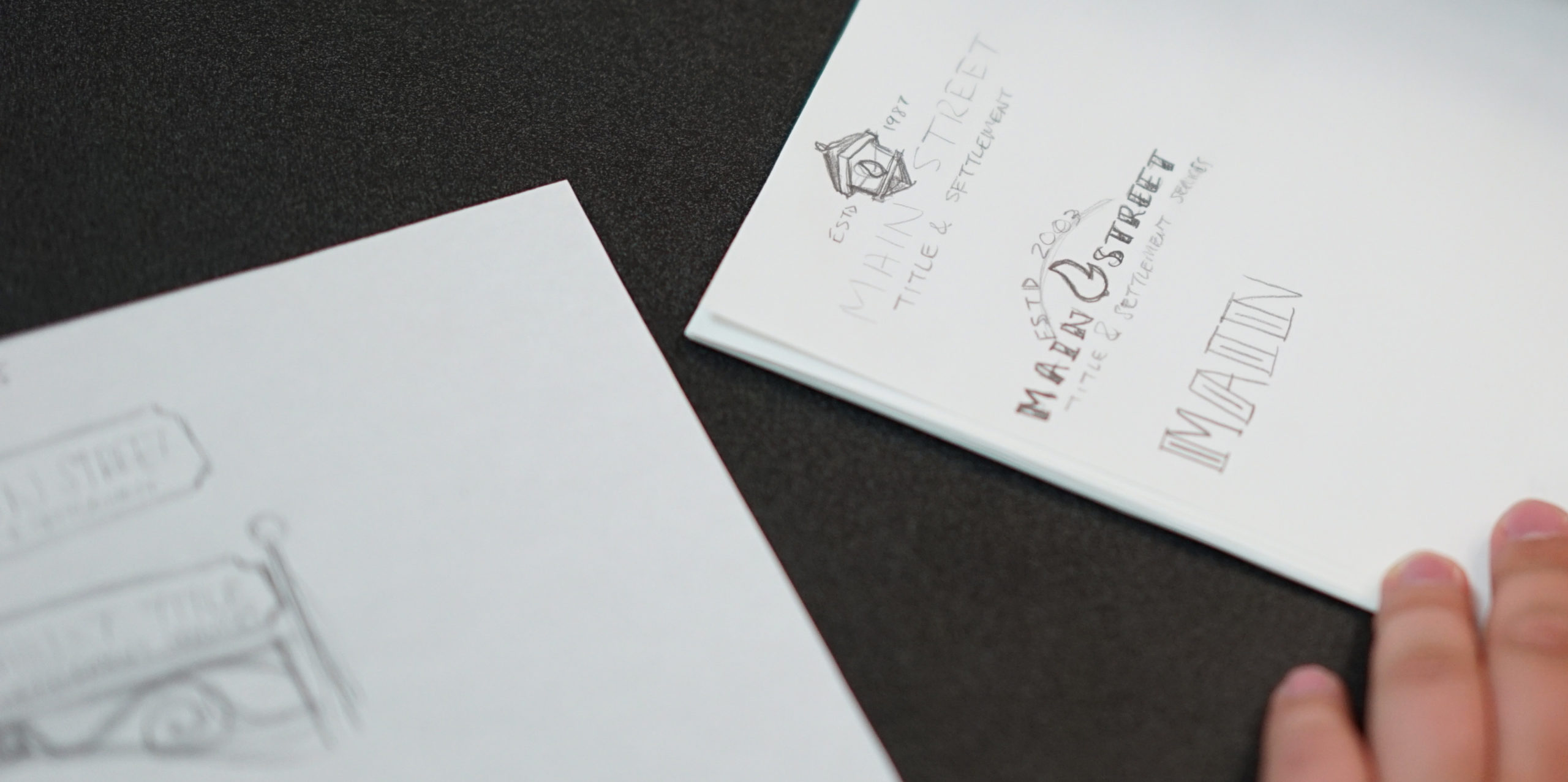
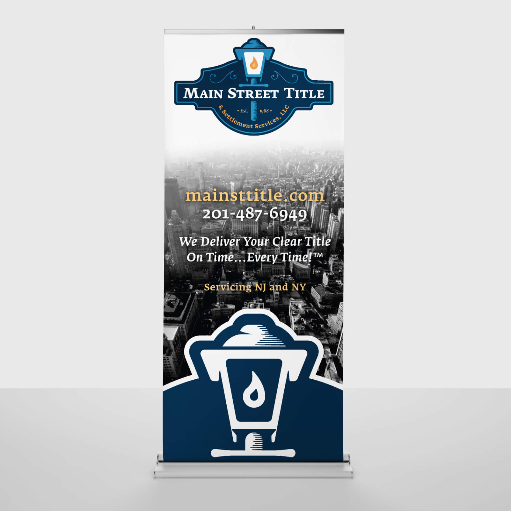
Main Street Title wanted to incorporate the original logo’s lantern motif, executed with classic style that would feel fresh while paying homage to company founders.
Color Scheme
Dark blue
light blue
orange
yellow
Typography
Fedra Serif A Medium

Fedra Serif B Normal

Traditional. Relevant. Forward-Thinking.
Title insurance is a very serious part of the real estate transaction process that most people don’t know a lot about. So when new home buyers are working with Main Street Title, brand consistency at every touch point is vital to creating trust in the company.

Web Design
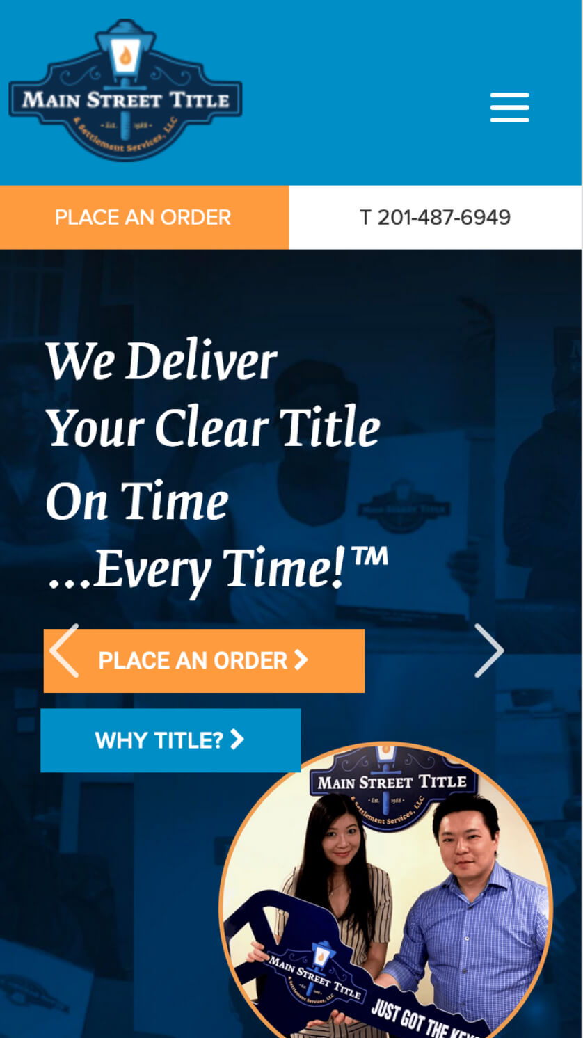
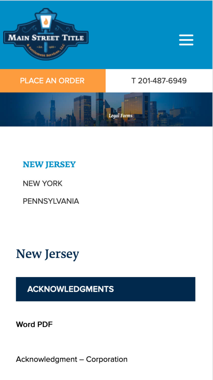
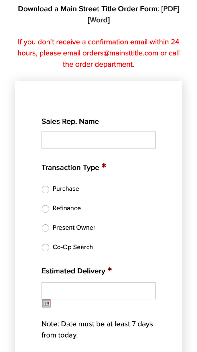
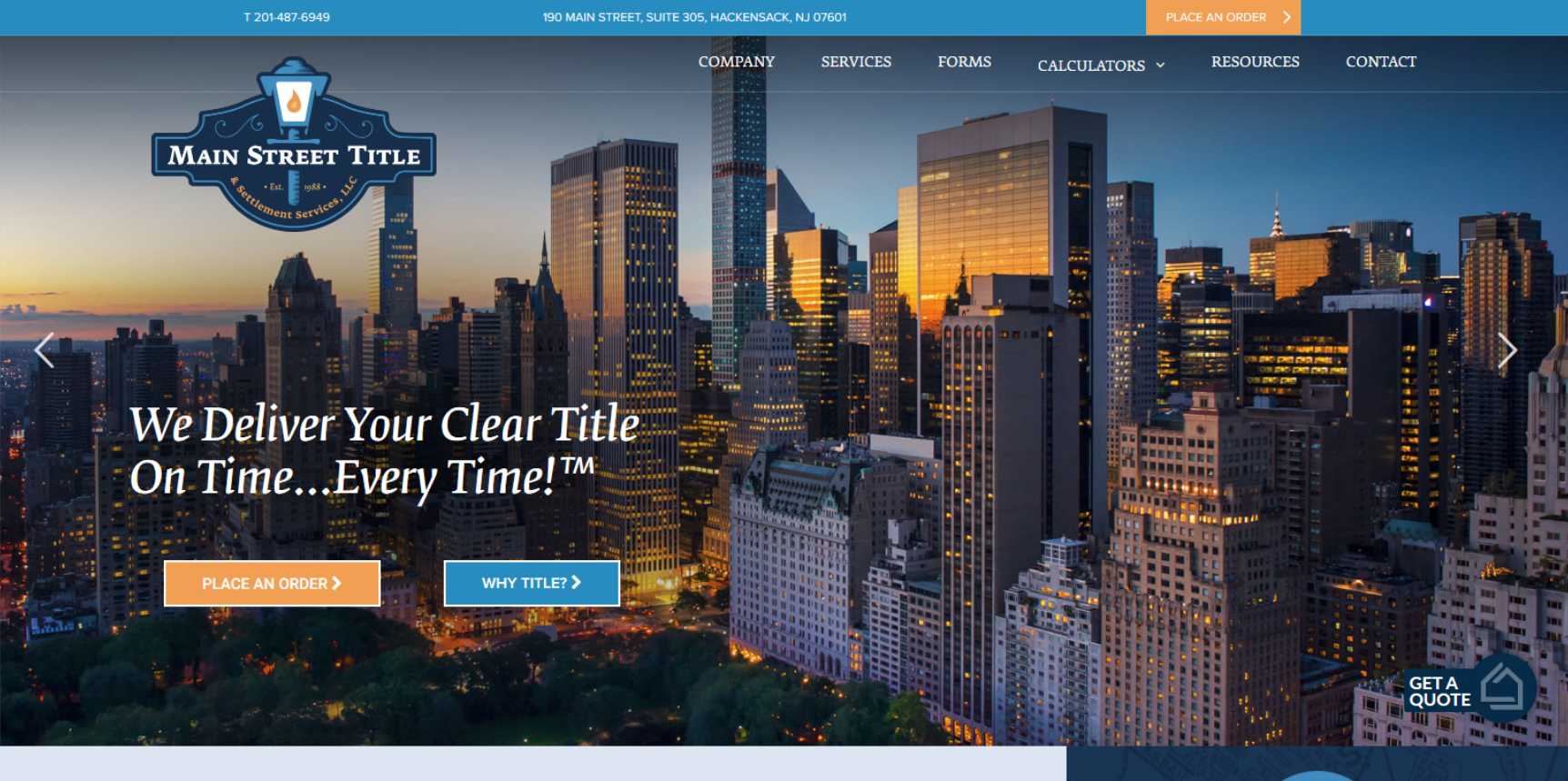
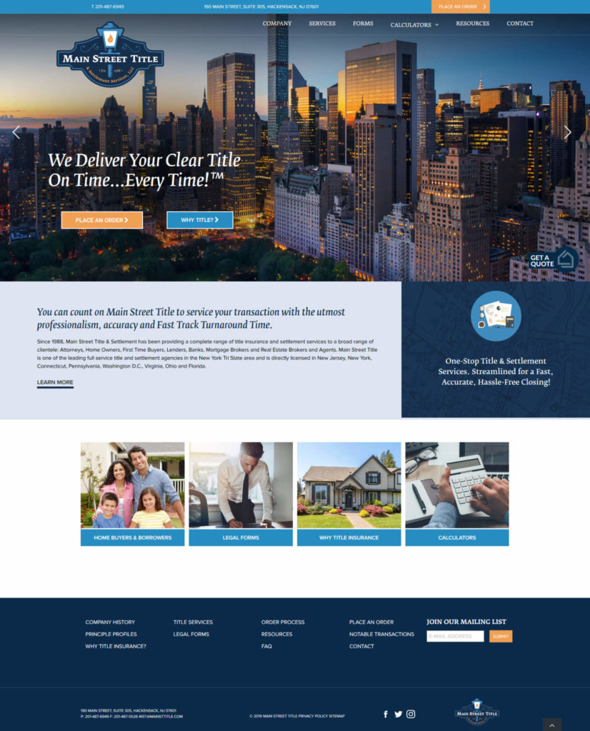
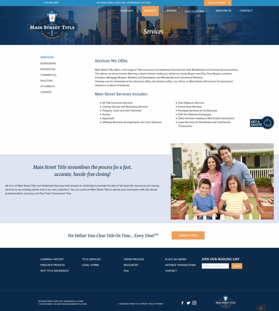
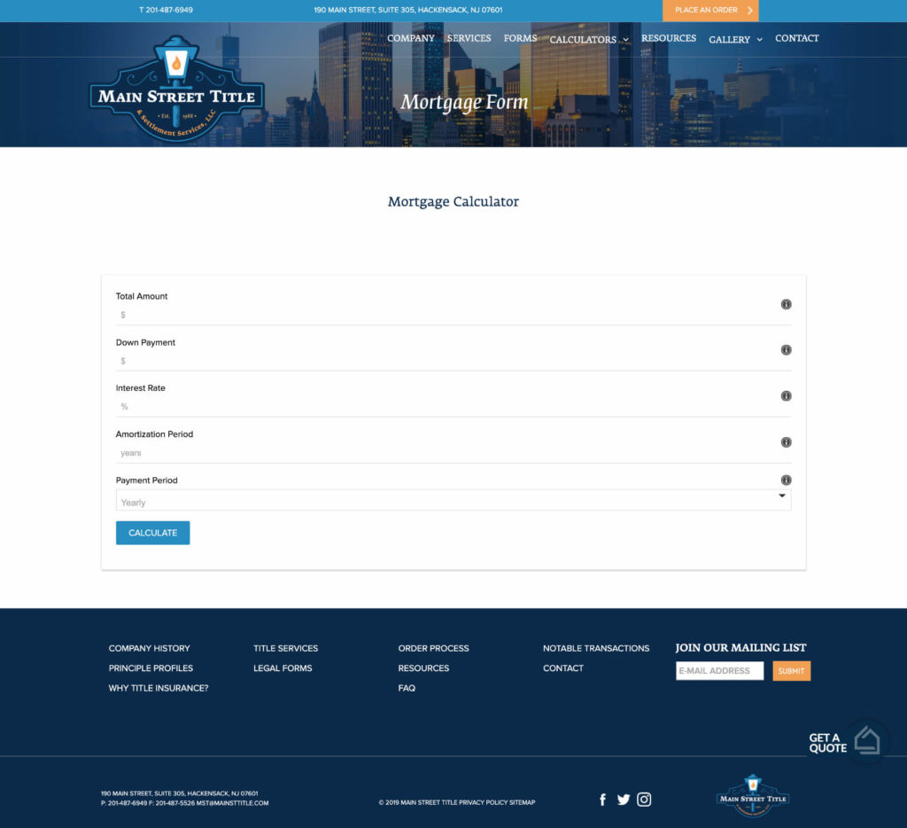
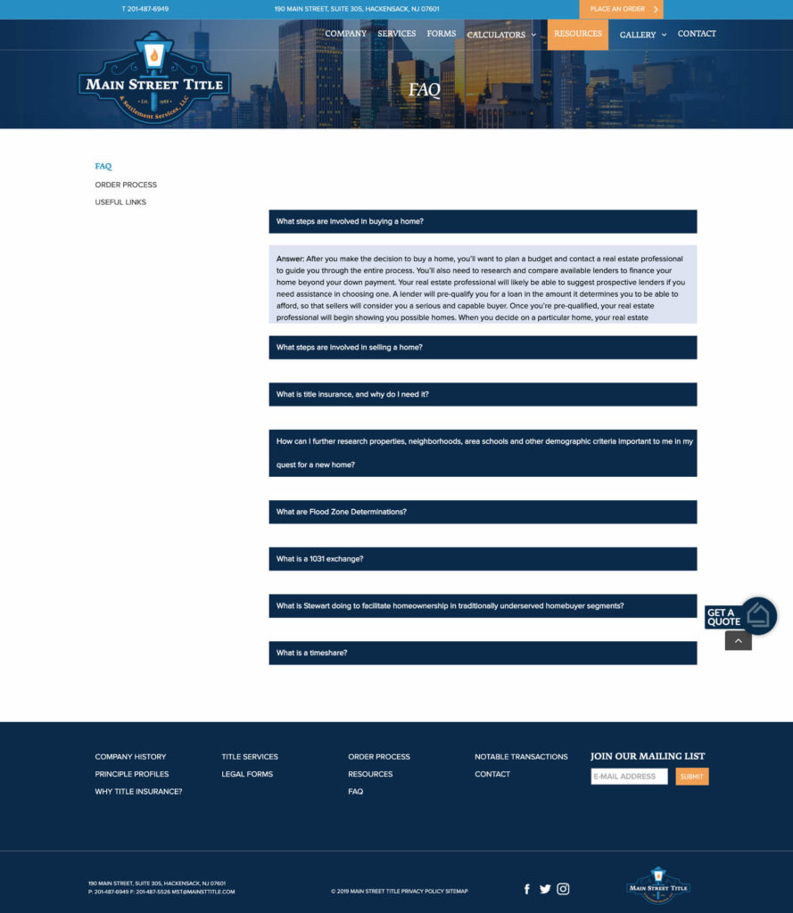
Along with great style, Main Street Title required a site with top-level functionality for maximum usage. They wanted to allow users to order title insurance directly on the website, download required state documents, and quickly calculate payments. Pix-l Graphx delivered on all fronts, and made sure all functions worked seamlessly on mobile as well for a new wave of tech-savvy homebuyers.
Mobile
