fattys.
Fattys is a place made for foodies who crave something more than the average burger. So we had to deliver a complete restaurant brand that was really bold and full of life. A real-life fatty.
Project brief
Fatty’s was born from the Creative Mind of a franchise owner who wanted to operate under his own rules and make things that people would never forget.
Branding
Just Like Their Sandwiches, Big & Bold
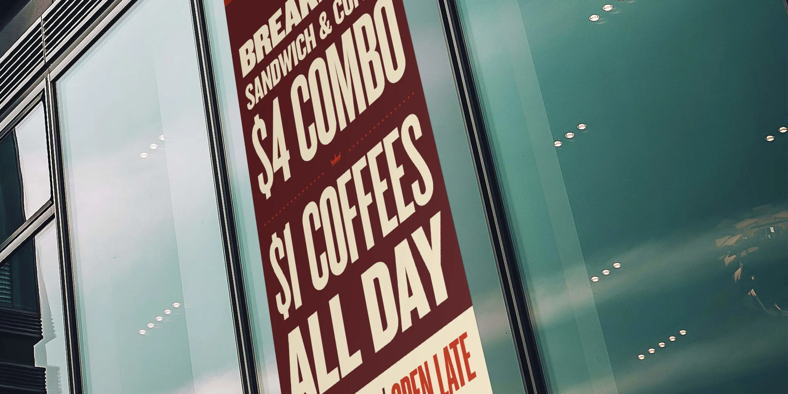
The team at Fattys wanted everything to really pop. So we focused on using typography and large photos to highlight their oh-so-special Fat Truck style Fatty sandwiches.
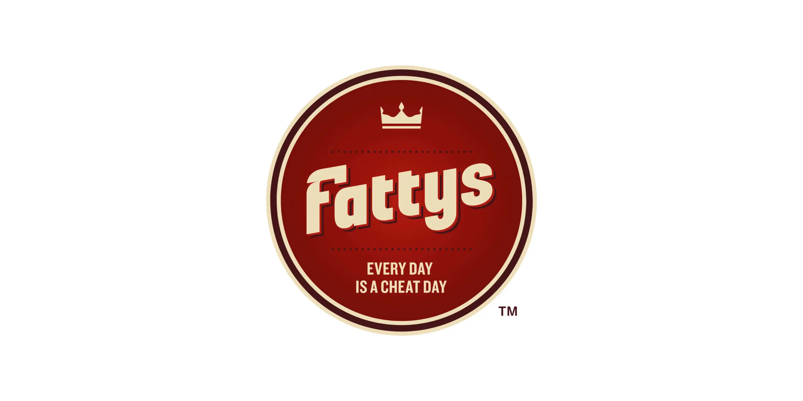
Color Scheme
red
#BF311A
beige
#F1E5C7
burgandy
#571C1F
Typography
Sentinel Bold

Knockout JuniorWelterwt

Package Design
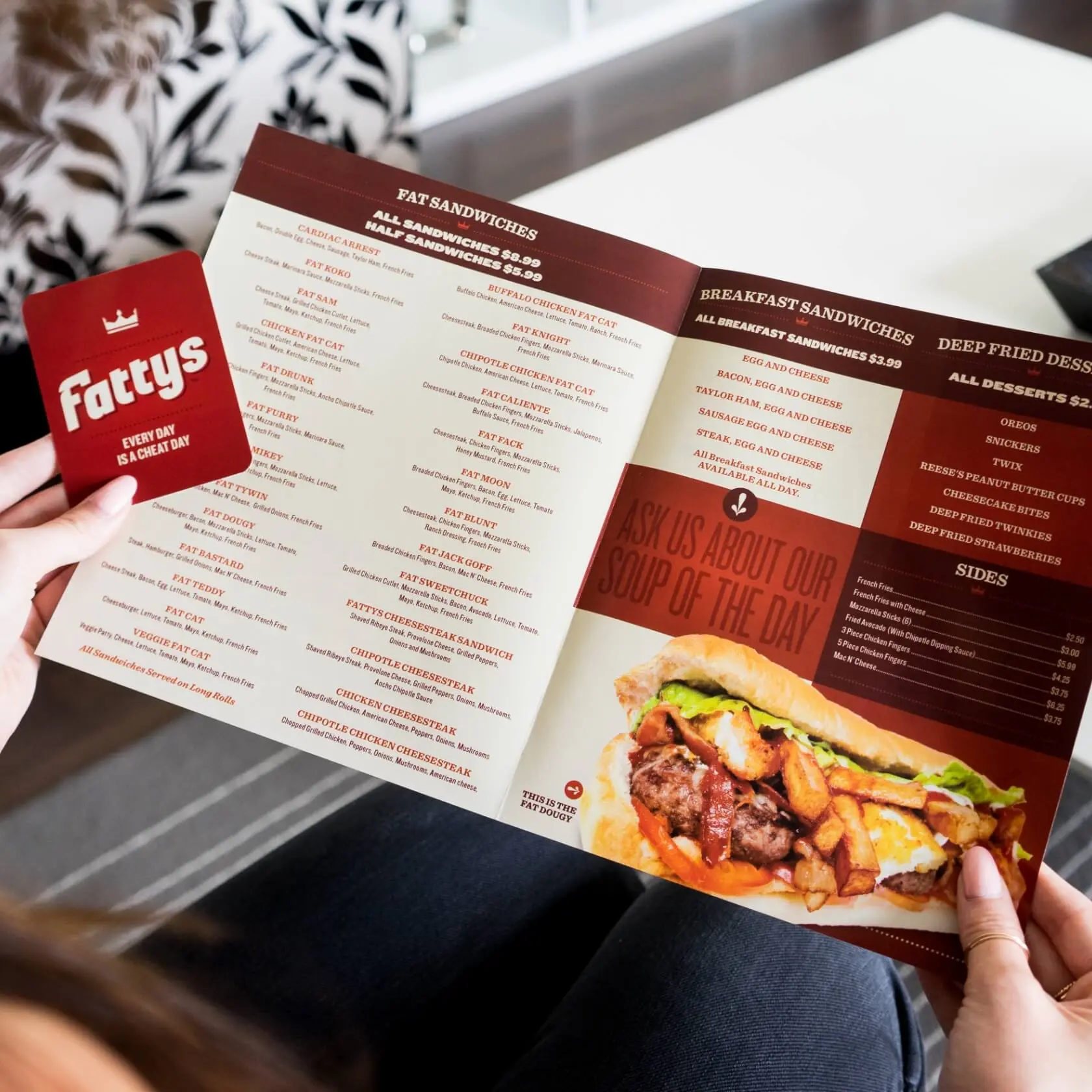
Every Menu Has Sides
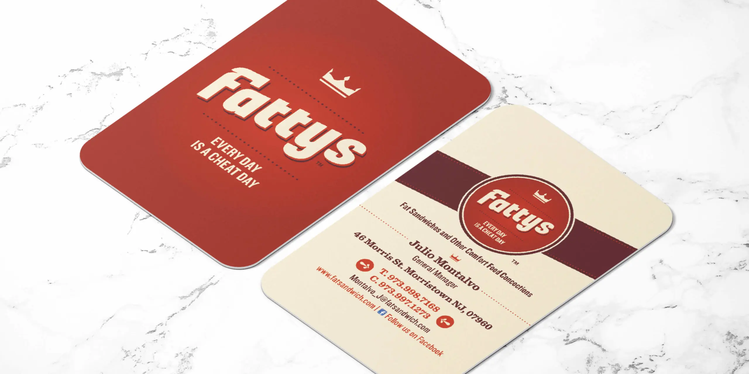
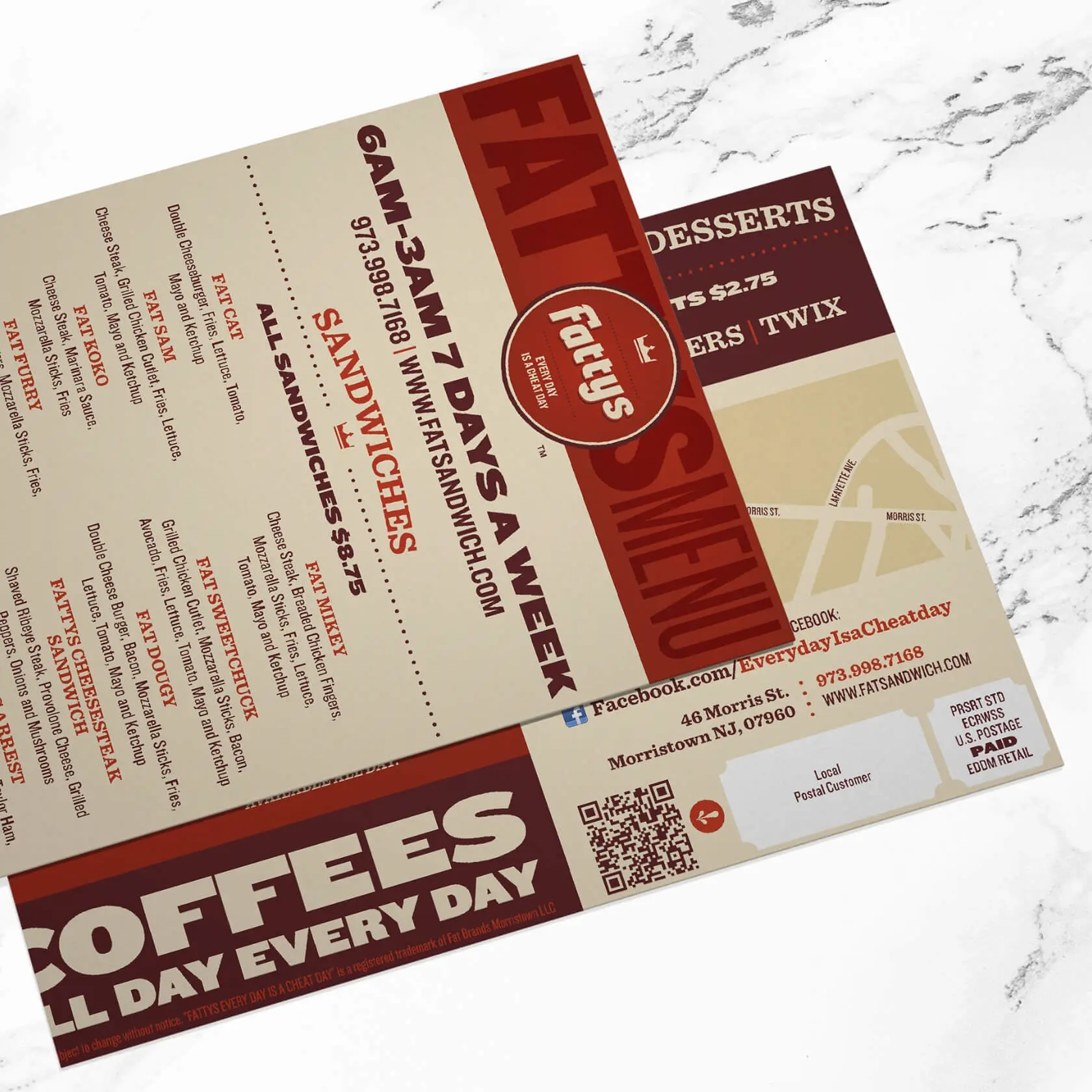
After creating launching their new menus and giving them a professional look with their own style, we were commissioned to extend the brand with multiple items.
New Branded Items
- Owner Business Cards
- VIP Member Card
- Takeout Menus
- Happy Hour Menus
- Specialty Menus
web
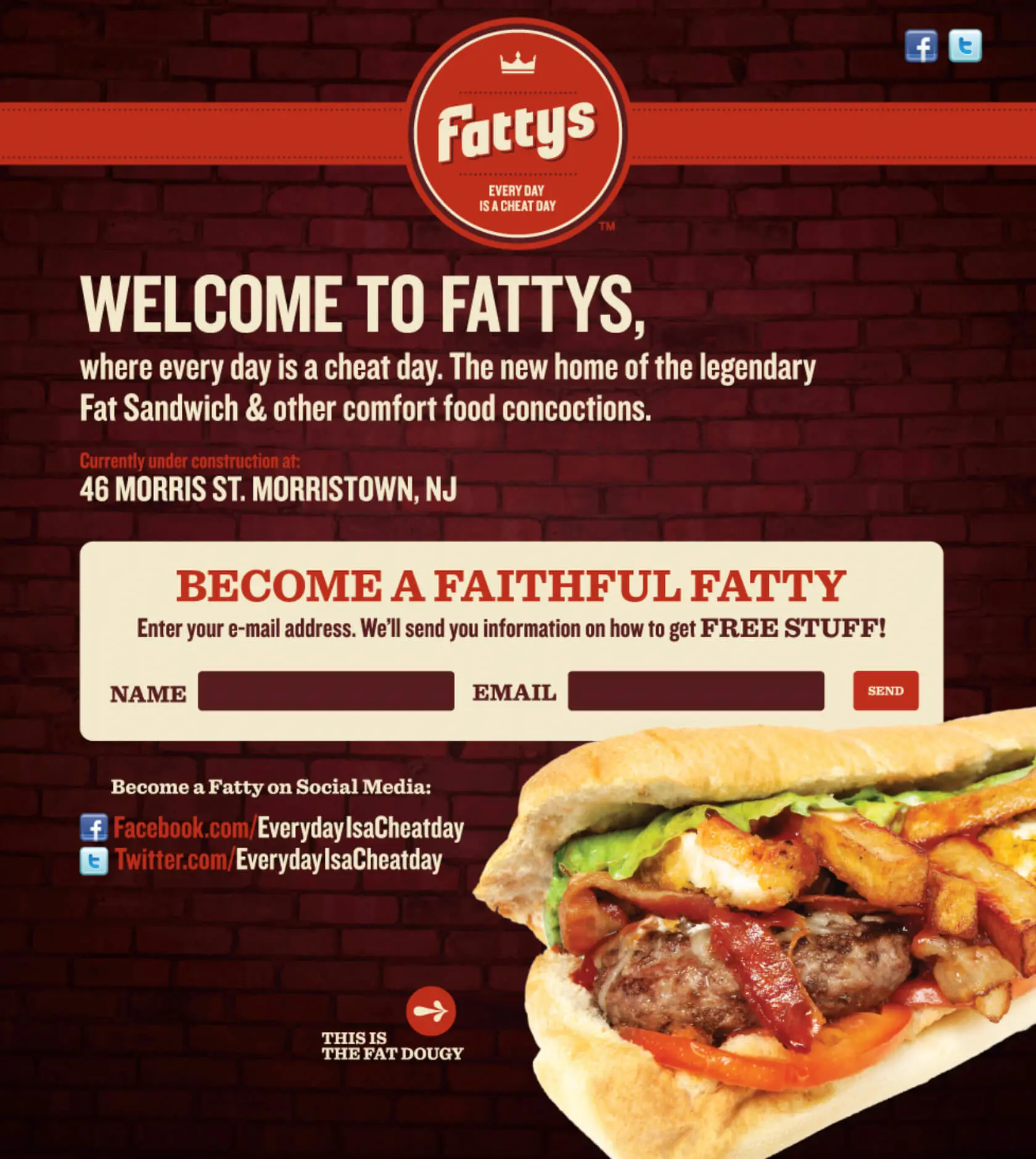
Fattys Online
The creator of Fattys, Michael Dey, did an amazing job showcasing the journey of Fattys before the actual launch. This led to thousands of people following this journey. We created a one page website to generate leads of people interested in the Grand Opening week for Fattys’
