Caliber health plus.
Caliber Health Plus brings high quality, dependable healthcare home. Pix-l Graphx was tasked with delivering a brand and a website to illustrate compassion and professionalism, as well as much-needed traffic. Since launching the brand, Caliber Health Plus has seen exponential growth year over year.
Project brief
In 2013, Pix-l Graphx began the journey of developing this unique brand in the home health industry. Marketers started from the ground up with a competitor review, full Q&A with the CEO, and a mood board that pulled branding samples from various industries.
Branding
The Right Look
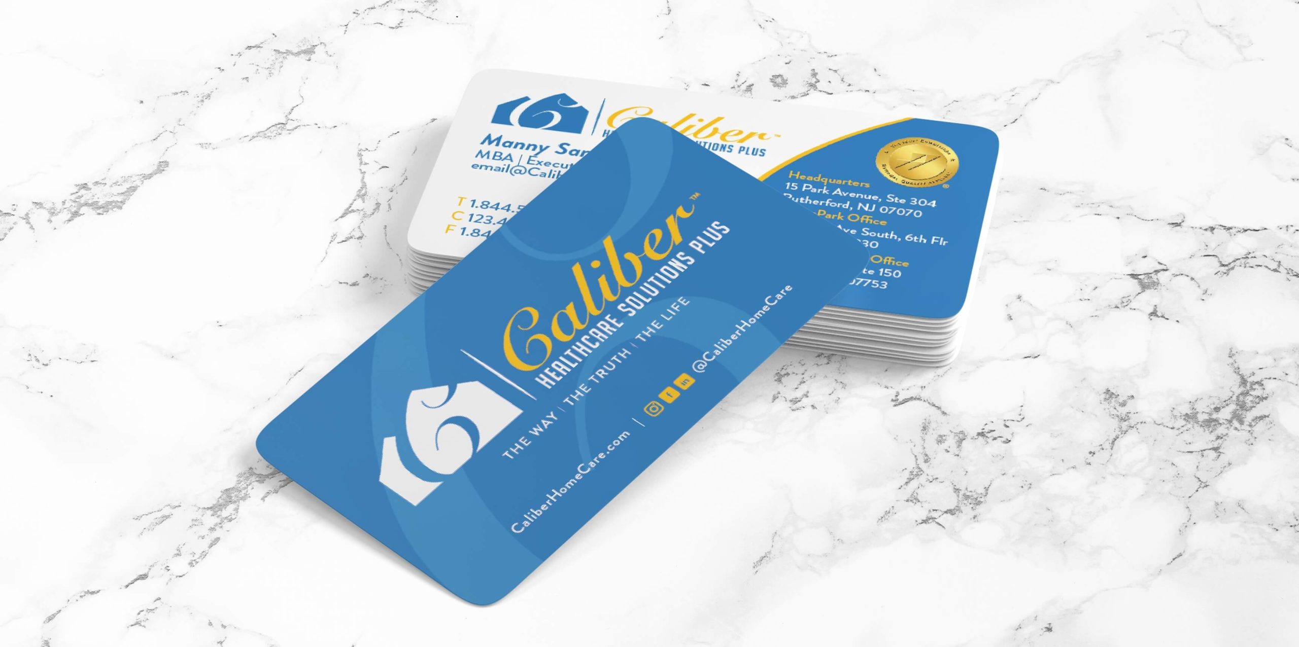
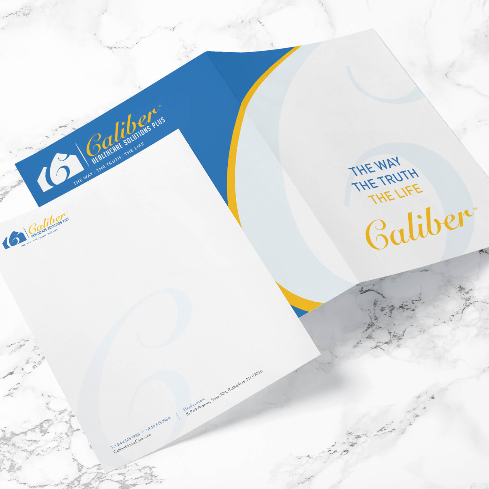
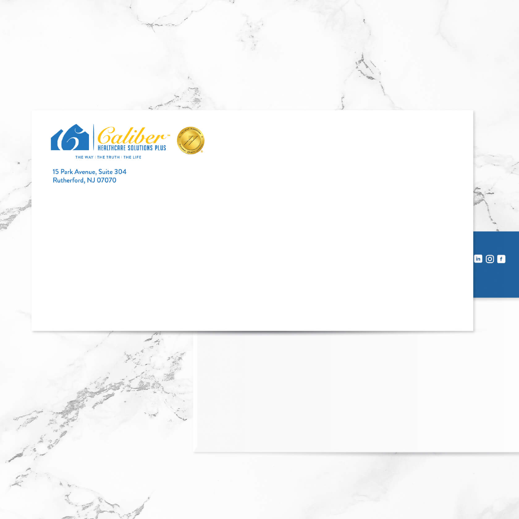
The team at Caliber Health Plus wanted to be taken seriously in this industry. They needed a look that evoked the feeling of trust, true professionalism, and class. The Pix-l team guided them through a brand strategy that included colors, fonts, and a design identity that would be a successful match for their vision.

Color Scheme
blue
yellow
gray
Typography
Brandon Grotesque - Medium

Brandon Grotesque – Regular


Web Design
A digital-first approach to branding
In the home care industry, the majority of people in need of care are directed by a healthcare professional. But there is a growing demand for private care. Caliber Health Plus needed a website that would not only be great for face value but also an effective tool for search traffic growth in the private home care sector. With a custom design and development in WordPress, Pix-l Graphx created an easy flow for the consumer to find more details and contact Caliber Health Plus 24 hours a day, seven days a week.

