ROI is on every business owner’s mind! After working with Manhattan Lasik Center on a search engine optimization campaign the past year, they finally decided it was time for an up-to-date mobile website design. Their primary focus was ensuring the new website would positively impact their ROI once completed.
For the past year, even with additional SEO services, Manhattan Lasik saw a trend of less traffic to their website. They attributed the dropping traffic to not having a mobile-friendly website. However, with Google’s recent Mobilegeddon update, all websites that were not mobile-friendly saw a dramatic drop in Search Engine Ranking.
To produce a mobile-friendly website with a significant Return On Marketing Investment, we focus on incorporating the following ten items.
Seven Important Factors for a Successful Mobile-friendly Website Relaunch
Develop with SEO In Mind
Search engine optimization is at the forefront of our thinking with every website project. Key SEO factors like website speed, optimized user experience based on matching user intent, and appropriately sized images for viewing on multiple devices are critical.
Transfer All Data From You Previous Website
We put a lot of work into Manhattan Lasik Center’s SEO, so to launch a new website, we had to be careful to avoid broken links, resulting in a loss of traffic and Search Engine Ranking. So we transferred all SEO pages, allowing MLC to keep its current Google ranking!
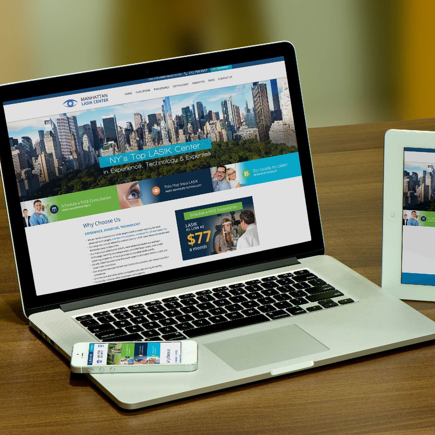
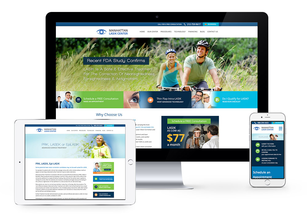
Mobile Friendliness on All Devices
We noticed 40 – 50% of all Manhattan Lasik Center’s traffic is from a mobile device. So we created a responsive website, allowing potential clients to easily view, read, and fill out forms on any mobile platform.
Having a mobile-friendly website design means ensuring mobile users have a pleasurable experience on your site. Therefore, a detailed review of the experience on every viewing option is vital. Our team inspects all tablet sizes, Android and Apple iOS devices, and multiple laptop sizes.
The Right Look on Mobile Devices
Designed with vivid colors, appealing imagery was a must. All images were optimized and sized appropriately for a mobile screen to ensure the load time was not negatively affected.
We also wanted the website to have a modern feel and be easy for someone to get lost in research. A few other key factors we always make the top priority:
- The available screen space
- The website’s loading time
- Using large and readable font and typography
- The page length on the mobile device
Mobile Responsive Landing Pages
We tried to include plenty of landing pages with forms to encourage users and potentially increase the ROI on the site. This was extremely important for our online marketing and search engine optimization campaigns.
These mobile-friendly forms included:
- Properly sized web forms with a responsive design to adapt to any screen size
- Buttons that were easily clickable for users on smaller screens
- Captcha codes that did not require additional a pop up
Optimize the Mobile Experience for Maximum Conversion
To make it truly easy to navigate, we looked back at Google Analytics and saw what pages had the most views. Then we took those pages, added them to the menu bar, and buttons on other pages to draw attention and make it easier for people to quickly find the information they are looking for.
We designed the information to be easy for people to find, fill out forms, and contact Manhattan Lasik for a consultation right on the user’s device.
Higher Conversion Rate Capturing Leads
With the new mobile-friendly website design, Manhattan Lasik Center experienced increased conversions on its website. The optimized user journey from landing pages to conversion pages on mobile devices was a key factor in reaching this goal!
Since we launched this website, we have had nothing but favorable reviews! So, we jolted this out-of-date website into the modern mobile-friendly website world!
To see a few of our recent website projects featuring top-notch responsive web design, click here to see a few of our other very satisfied clients.
For more information on how we can help you increase conversions with potential customers, contact us today!